
As a crucial skill for Excel users, learning how to create a goal line on a chart can significantly enhance your data presentations. This guide is designed to help you seamlessly integrate a goal or target line into your Excel charts, offering a visual method to compare actual performance against set objectives.
Whether you are a beginner or an experienced Excel user, this step-by-step approach will equip you with the tools to effectively visualize and analyse performance metrics.
Table of Contents
Understanding the Goal Line Concept
Before we dive into the ‘how-to’, let’s clarify what a goal line is.
In Excel, a goal line (also known as a target line) is a feature you can add to your charts to visually represent a specific target or objective. This line serves as a benchmark, helping viewers quickly see how the actual data compares against your set goals.
For instance, if you’re tracking sales performance, a goal line on your sales chart can instantly show how close you are to meeting or exceeding your sales targets. This visual element is invaluable for business analysis, making it easier to interpret data and make informed decisions.
How to Insert a Goal Line
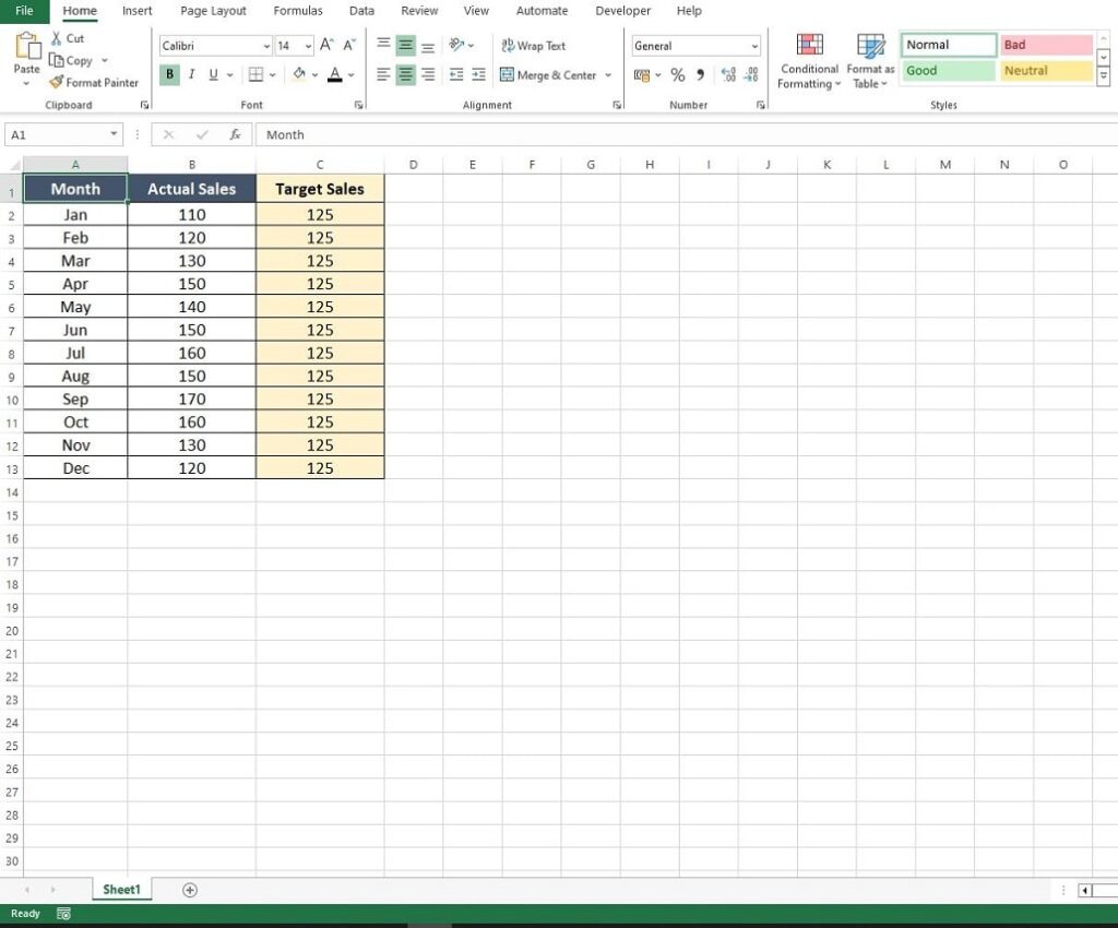
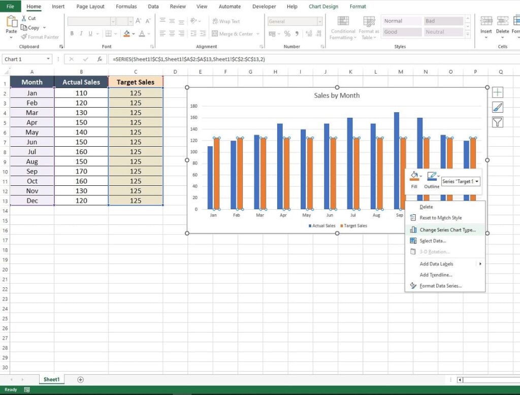
The initial step in this process is to incorporate your goal or target values into the dataset you’re charting. For instance, if you’re working with a dataset that includes actual sales figures, it’s important to add the target sales figures alongside for a comprehensive comparison.
As illustrated in the example below, you’ll see actual sales by month, accompanied by an overall monthly target of 125 sales. Your goal may require varying values for each period, or it might be a consistent average like the one shown. Regardless of the nature of your target, simply add these figures into a new column in your dataset for clear and effective analysis.
Create the Column Chart
The next step is to create the standard Excel column chart, but rather than just including the actual sales as a data series you need to ensure you include both the actual and target sales as data series.
The quickest way to get a chart started is:
- Highlight all the data (in this example that is the range A1:C13)
- Click on the “Insert” option on the Excel ribbon that goes across the top of the worksheet.
- Select the drop down arrow on the Column Chart icon in the top left of the Charts section; this displays the available Column Charts
- Select the first chart option available for this example, in this case a 2D Column.
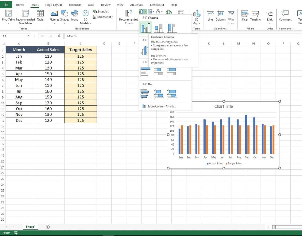
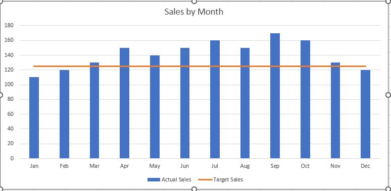
You are presented with a chart that should display both the Actual Sales and the Target or Goal Sales.
However, both the values are represented by columns so we need to do a little more formatting.
Transforming Target Sales Data into a Goal Line on a Chart
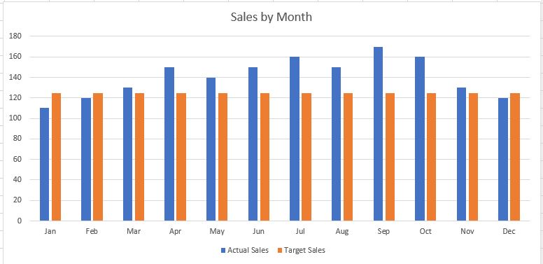
Initially, when you create a chart in Excel, the target sales data is displayed as a second data series in a column format, adhering to the chart type you initially selected, such as a column chart in our scenario.
This setup effectively presents both actual and target sales as columns, aligning with Excel’s default formatting. However, the key goal is to adapt the visual representation of the target sales to effectively serve as a goal line on the chart.
This critical transformation enhances the chart’s readability, positioning the target sales not merely as an additional dataset, but as a clear benchmark or goal line, facilitating easier analysis and comparison.
To begin this transformation, position your mouse cursor over any column that represents the target sales data series (in this example, they are the orange columns).
Then, right-click to bring up the context-specific options menu, and select ‘Change Series Chart Type.’ This action will convert your target sales data into a line, visually distinct and serving as an intuitive goal line on your chart.
You are then presented with the Change Chart Type dialog box again.
In the lower section of this box you can use the dropdown option next to the Target Sales to change the chart type for that series. Click on the dropdown and select the Line chart option and click OK.
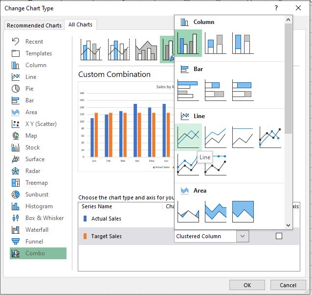
Your chart is now transformed, displaying the target sales as a line while keeping the actual sales as columns.
This effectively illustrates how to insert a goal line on a chart.
Summary
To effectively insert a goal line on a chart in Excel, begin by incorporating your target values into the existing data table. This ensures that both actual and target metrics are prepared for comparison.
Next, proceed to generate a standard chart that encompasses both sets of data, actual and target, thereby creating a dual data series representation. This step is crucial for visualising the relationship between your real-time performance and your goals.
The final touch involves transforming the appearance of the target data series. By right-clicking on the target data series in your chart and selecting ‘Change Series Chart Type,’ you can convert the target values into a line format. This change distinctly differentiates the target values, elegantly presenting them as a goal line, which juxtaposes against the actual data, typically shown as columns or bars.
By following these steps, you can create a visually compelling and informative chart in Excel that clearly illustrates how your data measures up against set targets or goals.
Keep Excelling,
Mastered adding a goal line on a chart in Excel? Take your data analysis skills further by learning how to insert a trend line in excel. Dive into our detailed guide and enhance your Excel expertise!