
Creating a chart in Excel is a fundamental skill that can transform your data into insightful visual representations. This guide is designed for beginners, easing you into the process of chart creation in Excel.
We’ll cover the essential steps and provide tips to enhance your chart-making experience. Whether you’re looking to present data in a professional setting or simply want to organize information effectively, mastering chart creation in Excel is a valuable skill.
Let’s start your journey into the world of Excel charts, where numbers transform into visual stories, making data analysis both accessible and engaging.
Table of Contents
- Introduction to Excel Charts
- Inserting an Excel Chart
- Understanding Chart Components in Excel
- Positioning and Sizing Excel Charts
- Adding a Title to an Excel Chart
- Formatting the Legend in an Excel Chart
- Summary
Introduction to Excel Charts
In the first post of this charting series we looked an overview of charts in Excel. That post covered the various chart types available in Excel, and some of the main reasons to use them.
For this post we’ll look at creating a chart in Excel; the steps involved in creating your first chart in Excel, along with some of the formatting options that will help you produce a visually appealing chart.
Starting steps
To begin with we need some data to chart. If you have your own data to hand then feel free to use that or you can download the following Excel file which will help you work through examples.
Download Example DataInserting an Excel Chart
To create a chart you first need to highlight your data and then select “Insert a chart“. Excel will build the chart type of your choice using the data that you have highlighted.
This method is generally the quickest way to produce a chart but as with many features in Excel there are other methods you can explore. Lets start by creating a chart the most common way.
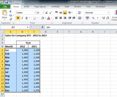
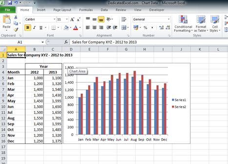
Select your data: To do this select the upper left cell of your data, for this example cell A5. Then drag the cursor down and across to the last cell of data cell C16. Your data should take on a highlighted appearance:
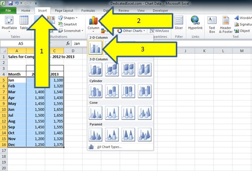
Insert the chart: With the data highlighted select the “Insert” tab across the Excel ribbon which is found at the top the worksheet. For this example we will create a standard column chart by selecting the “Column” icon and the standard column chart:
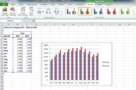
Review your creation: Creating a chart in Excel is that simple! Your worksheet and should look similar to this, with a nice chart for you to start formatting.
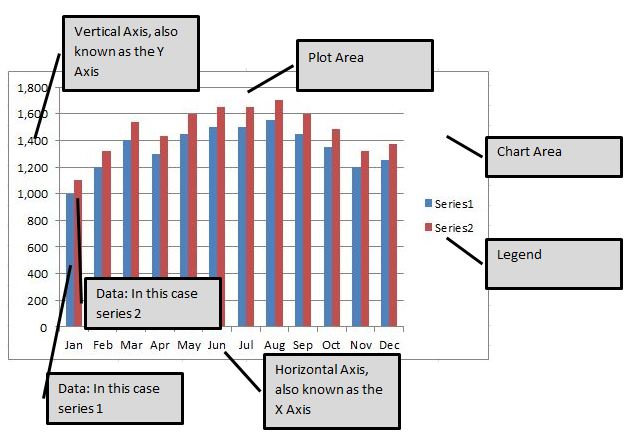
Understanding Chart Components in Excel
Creating a chart in Excel involves working with a ‘chart object’, which consists of several customisable components. Each component plays a vital role in the overall appearance and functionality of your chart.
As you delve into chart creation, it’s important to recognise these elements, as they can be individually formatted to suit your specific needs. This means you have the flexibility to select and modify any component — such as adjusting its position, altering text styles, or applying various formatting options typical in Excel.
Mastering these components empowers you to create charts that are not only informative but also visually compelling.
Positioning and Sizing Excel Charts
Once you’ve finished creating a chart in Excel, you might want to adjust its position and size for better integration with your report. Excel treats a chart as an object, which can be easily moved and resized.
To Reposition a Chart:
- Click the chart to select it. You’ll notice the border thickens, indicating selection.
- Drag the chart to a new position by clicking and holding within the chart area, then release to set its new location.
To Resize the Chart:
- Hover over any corner of the chart until the cursor turns into a diagonal arrow, indicating the resize option.
- Click and drag to adjust the chart’s size. Releasing the mouse sets the new dimensions.
With these steps, you can effectively move and resize your Excel chart, ensuring it complements your worksheet precisely.
For example – reposition the Excel chart you created so it fits alongside the data table.
Adding a Title to an Excel Chart
Incorporating a title in your Excel chart is a crucial step in creating a chart in Excel. A well-chosen title provides context and enhances the chart’s clarity for the viewer.
While it’s true that a title consumes some space, its benefits in conveying the chart’s purpose often outweigh this minor drawback. If the data representation is self-explanatory, you may opt to skip the title, but in most cases, adding one is advisable for clarity. A title helps users quickly grasp the essence of the chart, making it a vital element, especially in professional or educational settings.
Remember, a clear, concise title can significantly elevate the impact and understanding of your Excel chart.
To add an Excel chart title:
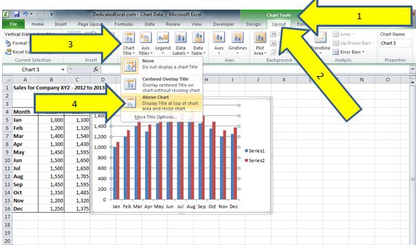
1) Select the chart by clicking anywhere on the chart.
2) On the Excel Ribbon (locate across the top of the Excel workbook) you will now see additional options called “Chart Tools” (1). The “Chart Tools” option will only appear when you have a chart object selected, it remains hidden at all other times. Within the “Chart Tools” option select the tab called “Layout” (2) then select the icon called “Chart Title”(3) and for this example we will add in a title “Above Chart”(4):
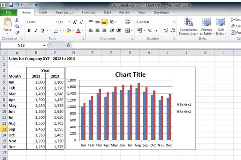
3) Your chart should now look like the below image with the words “Chart Title” added as a title:
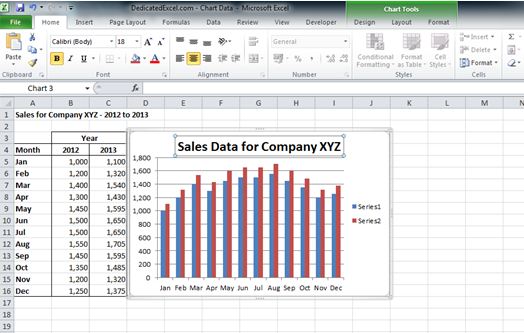
The chart title, once added, becomes an independent component of the chart in Excel. This allows for individual selection and customization of the title.
To modify the chart title, click on it to select. This action will highlight the title with a surrounding box. You can then either directly edit the text by clicking again and typing your desired title, or delete the default ‘Chart Title’ and enter a new one. This feature offers flexibility in personalizing your chart, ensuring the title accurately reflects the chart’s content and purpose.
Formatting the Legend in an Excel Chart
The legend in an Excel chart is a crucial element, serving as an interpretive key for understanding the represented data.
When creating a chart in Excel, it’s essential to remember that while you may recognize data series by their colours or patterns (like blue for 2012 and red for 2013 data in our example), your audience might not have this context.
Initially, Excel might label these as generic ‘Series 1’ and ‘Series 2’. A data series is a set of values plotted on a chart, and proper labelling of these series in the legend is key to making your chart comprehensible to all users. Ensuring that each data series is accurately titled and clearly distinguished in the legend enhances the chart’s readability and effectiveness, especially for those new to Excel. This attention to detail in formatting the legend is not just about aesthetics; it’s about making your data accessible and understandable, a vital skill in data presentation.
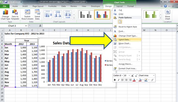
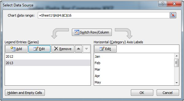
To change the legend names we need to drill into the data that feeds the chart, this is done by right-clicking on the chart and choosing the “Select Data” option from the menu:
When you have selected the “Select Data” option a new menu box will open up where we can edit the data that is feeding the chart:
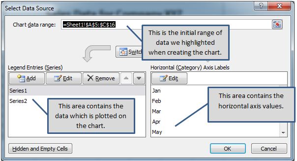
In the far left box you will see the current labels, “Series 1” and “Series 2”. Just above them is the Edit button which we can click on to edit that data series.
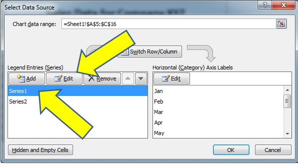
To edit Series 1 click once on the name which highlights it then left click on the Edit Button:
Another menu box will now open that shows you the following:
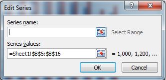
This menu box shows us the Series Name, which you can see is currently empty, along with the range of data that is currently associated with that series, in this example cells B5 to B16.
There are two options available to you to rename the data series, the first is we can simply type in a name in the empty “Series name” box, so in this case we know that the range B5 to B16 refers to 2012 sales so we can type in 2012.
Alternatively the preferred method is to link the name to a cell on the worksheet, which means if the name ever changes on the worksheet the legend will update automatically.
To do this click on the icon next to the Series name box:
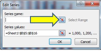
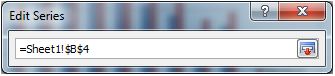
Then click on the cell you want to link, in this case it is B4 as that contains the title:
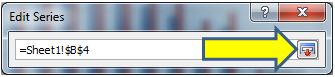
Click on the icon to the right hand side:
And then click OK:
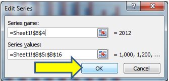
Now instead of “Series 1” the label has updated to “2012”. Repeat the process for Series 2 using cell C5 as the title so you end up with the following view:
The last step is to click on “OK” and the legend will update with the new labels:
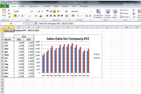
The updated chart legend clearly shows that the blue columns in the chart refer to 2012 and the red ones refer to 2013, which is a lot clearer to other users.
Summary
In this tutorial, we’ve explored the essentials of creating a chart in Excel, starting from selecting your data and using the ‘Insert Chart’ option.
We delved into the various components of an Excel chart, such as legends and plot areas, emphasizing their individual formatting capabilities. Key skills like repositioning and resizing the chart for optimal worksheet integration were also covered.
Additionally, we discussed the importance of adding a chart title for clarity and the steps to format the legend effectively, ensuring your chart is easily interpretable by your audience. This guide is aimed at empowering beginners with the skills needed for proficient chart creation in Excel.
There are many more options and features in charts to learn but with the ones explained in this post you have everything you need to get started on creating an effective looking chart within Excel.
Keep Excelling,
You are on your way to Expert level charting but don’t stop now! Check out this next post on dynamic chart titles in Excel and learn how you can automate your Excel Chart Titles and save time today!