
In the world of project management, efficiency and clarity are key. That’s where learning how to create a Gantt chart in Excel becomes invaluable. Whether you’re managing a complex project or simply coordinating a series of tasks, a Gantt chart in Excel offers a visual timeline of your project and helps in keeping track of deadlines and progress.
Introduction
Are you struggling to keep your projects organized and on track? A Gantt chart in Excel might just be the solution you’re looking for. This post will guide you through the steps to create an effective Gantt chart in Excel, making project management more accessible and visually appealing. From simple projects to more complex endeavours, mastering the creation of a Gantt chart in Excel will elevate your project management skills to the next level.

Topics in this Post
- What is a Gantt Chart?
- Why is it called a Gantt Chart?
- Why use a Gantt Chart?
- How to Create a Gantt Chart in Excel
- Additional Tips and VBA Code for Gantt Charts in Excel
- Summary
What is a Gantt Chart?
A Gantt chart is a type of bar chart that represents a project schedule. It illustrates the start and finish dates of the various elements of a project. When you create a Gantt chart in Excel, it becomes a powerful tool that provides a graphical illustration of a schedule that helps to plan, coordinate, and track specific tasks in a project. Gantt charts in Excel are widely used in business and academia for planning projects of all sizes and are a valuable tool in project management.
Why is it Called a Gantt Chart?
The term “Gantt chart” carries a historical significance in the world of project management. This chart is named after its inventor, Henry Gantt, an American mechanical engineer and management consultant. Gantt, who was a pioneer in the field of scientific management, developed this chart between 1910 and 1915.
Henry Gantt’s motivation was to provide a visual tool to help managers ensure that their production processes were on schedule. The original purpose of the Gantt chart was to improve manufacturing efficiencies, particularly during the First World War. Gantt charts in Excel or other software formats we see today have evolved significantly from their original design, but the core principle remains the same: visually tracking project schedules.
The legacy of Henry Gantt lives on in these charts, as they continue to be an indispensable tool in project management across various industries. By using a Gantt chart in Excel, modern project managers and teams connect with a century-old tradition of efficient project planning and execution. Understanding the historical context of the Gantt chart not only adds depth to your project management practices but also pays homage to the innovation that revolutionized the way we plan and visualize tasks and timelines.

Why Use a Gantt Chart?
The use of a Gantt chart in Excel is not just about visual representation of a project timeline. It is a practical approach to project management that offers several benefits:
- Enhanced Clarity: It provides a clear overview of the project, helping team members understand the tasks and deadlines.
- Improved Communication: A Gantt chart in Excel can serve as a focal point for discussions about progress and deadlines.
- Increased Efficiency: By outlining the entire project at a glance, Gantt charts help in identifying overlaps between activities and potential bottlenecks.
- Resource Management: It allows for effective allocation and management of resources throughout the project duration.
- Flexibility: With a Gantt chart in Excel, it’s easy to update and adjust to changes in project scope or timelines.
Incorporating Gantt charts into your project management toolkit can significantly enhance the organization and execution of your projects.
How to Create a Gantt Chart in Excel
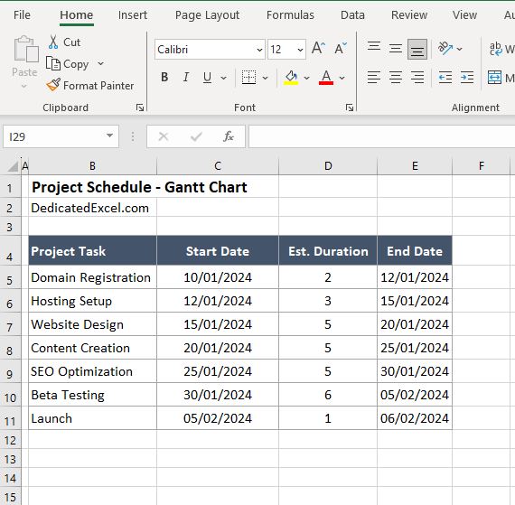
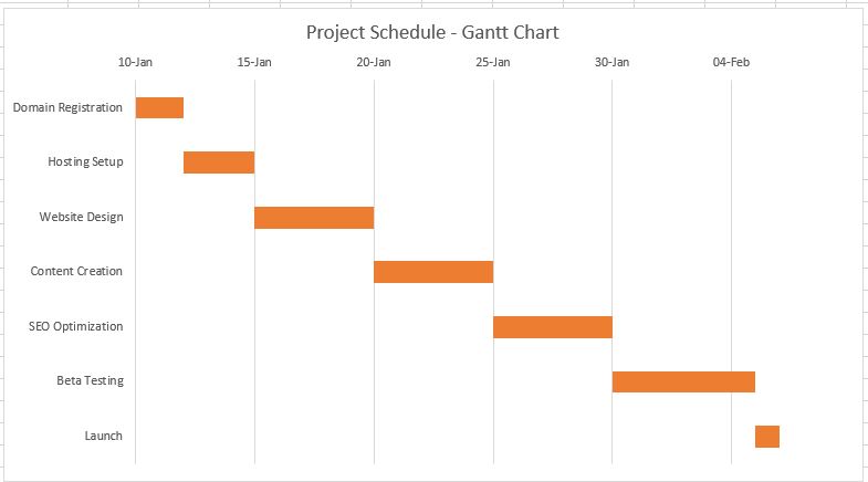
To best understand how to create a Gantt Chart in Excel consider the following scenario. You have been tasked with producing a chart that illustrates the project schedule for releasing a new website.
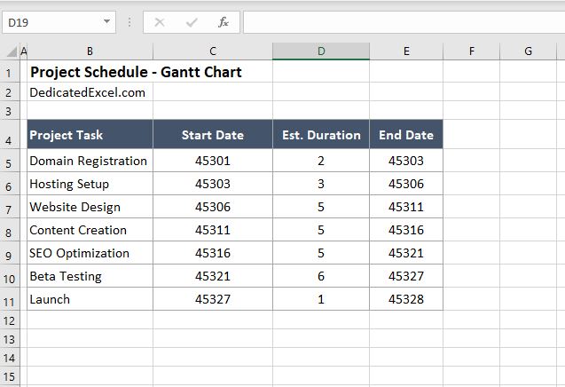
Step One: Organize Your Data
For this project we’ll need to capture the Project Task, Start Date, Estimate Duration and End Date. We can organize this in cells B4:E11 of the Excel worksheet.
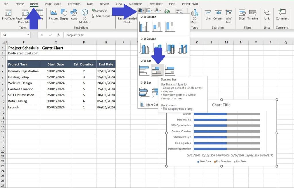
Step Two: Insert Stacked Bar Chart
There is no native Gantt chart in Excel therefore we need to get creative in order to make one. The first step is to insert a stacked bar chart using your data. To do so highlight your data then navigate to the ‘Insert‘ menu on the Excel ribbon, followed by ‘Insert Column or Bar Chart‘ and then select the option for a ‘2-D Stacked Bar Chart‘. This will generate a chart on the worksheet, although it’s not a Gantt chart yet.
Step Three: Chart Formatting
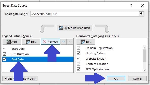
In order to produce a Gantt chart we need to make some changes to the existing chart.
- Right-click anywhere on the chart and select ‘Select Data‘ from the menu.
- In the ‘Select Data Source‘ options box select the ‘End Date‘ from the ‘Legend Entries‘ section and click ‘Remove‘. When you click ‘OK‘ the chart will now look slightly different.
Our chart still needs some more formatting to obtain a Gantt chart look using Excel.
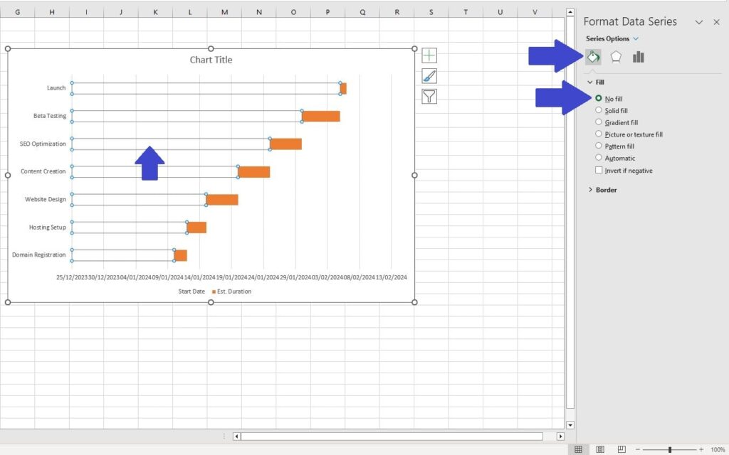
- Click on the ‘StartDate‘ series in the chart (in this example its one of the blue bars). This will highlight all of that data series. Right-click on one of the blue bars and select ‘Format Data Series‘.
- In the ‘Format Data Series‘ window select the Bucket Icon then choose ‘No Fill‘.
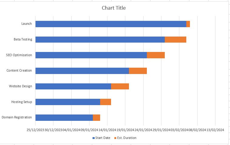
You have probably noticed that our charted project schedule reads in the wrong order. The Launch of the website is listed first and the Domain Registration is last. Lets go about changing that next.
- Right-click on the horizontal axis listing the Project Tasks and select ‘Format Axis‘ from the options box.
- In the ‘Format Axis‘ window check the box next to the option called ‘Categories in reverse order‘. This will show our project tasks in the correct order on the chart.

Step Four: Date Formatting
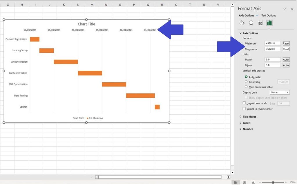
As our Gantt chart in Excel begins to take shape, attention must be turned to refining the date axis for clarity and precision. Currently, the chart’s date range extends well beyond the actual span of our project, with the first task appearing midway and leaving substantial unused space at both ends of the timeline.
To address this, we’ll adjust the chart’s minimum and maximum date bounds. Before proceeding, it’s crucial to understand how Excel interprets dates. Excel assigns a unique serial number to each date; for instance, January 1, 1900, is represented as ‘1‘, and January 1, 2024, as ‘45,292‘. This numeric representation is key to customizing our Gantt chart’s timeline.
- To set the date bounds effectively, convert the Start Dates (C5:C11 in our example) to their numeric equivalents. Right-click on these cells, select ‘Format Cells‘, and change the format to ‘General‘. This action will reveal the numeric values of the dates, allowing for precise setting of the axis bounds.
- Don’t forget to add the duration or convert the end date for the last project, so in this case we have a minimum date of 45,301 (10th Jan 2024) and a maximum date of 45,328 (6th Feb 2024).
- Convert the dates back to a ‘Date’ format after by right-clicking the cells (C5:C11) and select ‘Format Cells‘, and change the format back to ‘Date‘.
- Armed with the numerical date knowledge right-click on the ‘Date‘ axis on the chart and select ‘Format Axis‘. In the ‘Format Axis‘ window that appears change the minimum bound to 45,301 and the maximum bound to 45,328 (or whatever is relevant to your data).
Step Five: Final Formatting Changes
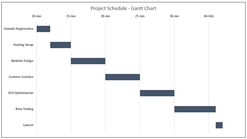
All of the tricky changes are now completed and you have a Gannt Chart in Excel. The final step is to tidy up the chart and make it look more professional and visually appealing.
- Right-click on the ‘Chart Title‘ and select ‘Edit Text‘. Insert an appropriate chart title, in our example we’ll call it ‘Project Schedule – Gantt Chart’.
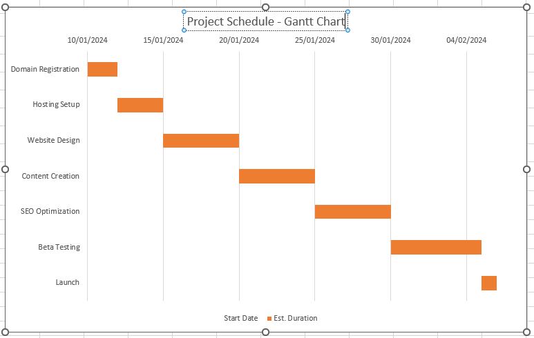
Next we can remove the legend. It’s misleading on this chart and taking up unnecessary space.
- Right-click on the data legend in the chart and select ‘Delete‘.
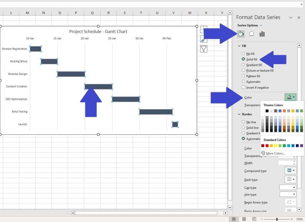
Finally if you are not a fan of the colour then we can change the colour of the bar from orange to something different.
- Click on one of the orange bars to select them all.
- Right-click on one of the orange bars and select ‘Format Data Series’
- In the ‘Format Data Series‘ window select the Bucket Icon then choose ‘Solid Fill‘ and then choose a different colour from the palette options.
You have now created a Gantt Chart in Excel, congratulations!
Additional Tips for Gantt Charts in Excel
While the basic steps to create a Gantt chart in Excel are straightforward, diving into advanced techniques can elevate your charts from functional to impressive. Here are some tips and advanced strategies for creating a Gantt chart in Excel that not only tracks your project efficiently but also stands out in its clarity and visual appeal.
Conditional Formatting
Add another layer of information by using conditional formatting. For instance, you can change the colour of task bars based on the task status (e.g., completed, in progress, delayed). Remember to try and use formulas in the conditional formatting rules to automate these colour changes.
Dynamic Date Range
Instead of using a static date range, make your Gantt chart in Excel more dynamic. Utilize formulas to automatically update the date range based on your project data. This ensures that your chart always reflects the current timeline without manual adjustments. If you want to learn more about creating dynamic data ranges then check out our guide on how to create named ranges in Excel.
Integrate with Other Tools
Consider linking your Gantt chart with other Excel tools like PivotTables or dashboards. This integration allows for a more comprehensive project management tool that can provide insights beyond just timelines.
Customize for Better Readability
Pay attention to the readability of your Gantt chart. Customizing the text font, size, and colour for task names and dates can greatly improve clarity. Additionally, consider alternating row colours for ease of tracking across the chart.
Use Excel’s Inbuilt Features
Leverage Excel’s inbuilt features like SmartArt, shapes, and text boxes to add milestones or key notes directly on the Gantt chart. This can be particularly helpful for highlighting critical dates or deliverables.
Automate with VBA
For those comfortable with programming, Visual Basic for Applications (VBA) can be used to automate the creation and updating of a Gantt chart in Excel. This can save significant time, especially for complex projects with frequently changing data. An example of VBA that will produce a Gantt Chart for the example in this post is:
Sub CreateGanttChart()
    Dim ws As Worksheet
    Dim chartObj As ChartObject
    Dim chartDataRange As Range
    Dim minDate As Double
    Dim maxDate As Double

    ' Set reference to the active worksheet
    Set ws = ActiveSheet

    ' Define the range that contains the chart data
    Set chartDataRange = ws.Range("B4:E11")

    ' Find the minimum and maximum dates (converted to serial numbers)
    minDate = Application.WorksheetFunction.Min(chartDataRange.Columns(2))
    maxDate = Application.WorksheetFunction.Max(chartDataRange.Columns(4))

    ' Add a chart object to the worksheet
    Set chartObj = ws.ChartObjects.Add(Left:=100, Width:=375, Top:=50, Height:=225)
    With chartObj.Chart
        ' Set chart type
        .ChartType = xlBarStacked

        ' Set data source
        .SetSourceData Source:=chartDataRange

        ' Remove the End Date series (assuming it's the last series)
        .FullSeriesCollection(.FullSeriesCollection.Count).Delete

        ' Formatting the chart to resemble a Gantt chart
        ' Reverse order of categories (tasks)
        .Axes(xlCategory).ReversePlotOrder = True
        ' Remove fill for start date bars
        .FullSeriesCollection(1).Format.Fill.Visible = msoFalse

        ' Format the date axis
        .Axes(xlValue).MinimumScale = minDate
        .Axes(xlValue).MaximumScale = maxDate
        .Axes(xlValue).MajorUnit = 7 ' Adjust as needed (e.g., for weekly intervals)

        ' Add a chart title
        .HasTitle = True
        .ChartTitle.Text = "Project Schedule - Gantt Chart"

        ' Remove the legend
        .HasLegend = False
    End With
End Sub
With some minor tweaks you can tailor this VBA code to your data range and create your own Gantt chart in Excel using VBA, saving you plenty of time when it comes to formatting!
Summary
Embarking on the journey to create a Gantt chart in Excel can transform the way you manage projects, big or small. This guide has walked you through the steps to not only create a functional Gantt chart but also to employ advanced techniques and VBA scripting for greater efficiency and customization. Remember, a Gantt chart in Excel is more than just a tool; it’s a reflection of your project’s heartbeat, visually capturing the pulse of deadlines, tasks, and milestones.
Whether you’re a seasoned project manager or new to the realm of project planning, mastering the creation of a Gantt chart in Excel is a skill that will pay dividends in clarity, communication, and control over your projects. We encourage you to use this guide as a starting point, experiment with the features and tips provided, and tailor your Gantt charts to meet the unique demands of your work.
As Henry Gantt’s legacy demonstrates, innovation in project management is ongoing, and your journey with Gantt charts in Excel is just beginning. We hope this post has inspired you to explore the vast potential of Excel in managing your projects more effectively.
Keep Excelling,

Struggling with cluttered Excel sheets? Uncover the secrets to effortlessly finding and removing duplicates, streamlining your data for clear, efficient analysis. Dive into our on How to Find and Remove Duplicates in Excel.