
Imagine you’re looking at a mountain range from above, seeing the peaks and valleys represented by different colors and lines. This is the essence of a contour chart in Excel.
It’s a powerful tool that translates complex three-dimensional data into a comprehensible two-dimensional format, making it an invaluable asset in your Excel toolkit.
In this post, I will show you how to create and customize a contour chart, enabling you to visualize and interpret your data with greater clarity and insight.
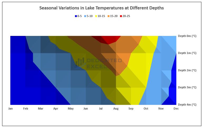
Table of Contents
- Introduction to the Contour Chart in Excel
- Why Use Contour Charts
- Benefits of Contour Charts
- Example – Gone Fishing!
- Customizing Your Contour Chart
- Analysing and Interpreting the Contour Chart
- Additional Tips for Contour Charts in Excel
- Summary
Introduction to the Contour Chart in Excel
In Excel, a contour chart, also known as a surface plot, is a graphical representation where three-dimensional data is displayed in two dimensions.
It’s an advanced charting technique that uses color gradients and contour lines to show variations in data values, ideal for illustrating geographical or meteorological data.
Why Use a Contour Chart in Excel
Contour charts in Excel are an exceptional tool for visualizing complex data. They allow users to see gradients and patterns in a set of three-dimensional data presented on a two-dimensional plane.
Here are some real-world scenarios where contour charts prove particularly useful:
- Meteorological Data Visualization: Contour charts are ideal for representing meteorological data such as temperature, precipitation, or atmospheric pressure over a geographic area.
For example, they can vividly illustrate how temperature varies across different regions and altitudes, providing valuable insights for weather forecasting and analysis. - Geographical Terrain Mapping: In geology or geography, contour charts can be used to depict the topographical variations of a landscape.
This is particularly useful in planning construction projects, hiking expeditions, or understanding water flow patterns in a given terrain. - Market Research Analysis: When analysing market research data, such as consumer preferences or product performance across different demographics, contour charts can help identify trends and patterns that might not be immediately evident in traditional chart formats.
- Engineering and Design: Engineers often use contour charts to visualize stress, strain, or heat distributions across surfaces, which is crucial in product design and safety testing.
- Medical Imaging and Analysis: In the medical field, contour charts assist in visualizing data from various imaging techniques, helping in diagnosing diseases or in the planning of medical procedures.
Benefits of Contour Charts in Excel
Understanding the advantages of a contour chart in Excel is crucial for anyone looking to elevate their data analysis and presentation skills.
Here are some reasons why learning this skill is advantageous to you:
- Enhanced Data Presentation: Contour charts transform complex data sets into visually engaging and understandable formats.
This is vital for effectively communicating your findings to an audience who may not be familiar with the raw data. - Pattern and Trend Identification: These charts are indispensable for identifying subtle patterns and trends in geographical and other continuous data sets.
Such insights can be pivotal in fields like environmental research, urban planning, and scientific studies. - Depth in Data Analysis: Mastering contour charts adds a significant depth to your data analysis capabilities.
It empowers you to explore and present your data in ways that go beyond the capabilities of standard chart types, making your analytical work more nuanced and impactful.
Learning to create and interpret contour charts in Excel not only broadens your skill set but also enhances your ability to make data-driven decisions and recommendations in a wide range of professional contexts.
Example – Gone Fishing, with Excel!

Let’s dive into a practical example to see how a contour chart in Excel can really shine.
You may have guess that I’m a bit of an Excel enthusiast, and when I’m not crunching numbers, you’ll often find me fishing at my local lake.
But even out there, I can’t help but mix my love for data with my hobby. Each fishing trip turns into a chance to gather some cool stats!
Every month, I record the temperature of the lake at five different depths. It’s not just about fishing; it’s about understanding how these temperatures change through the year. And guess what? This data doesn’t just help improve my catch rates – it also tickles my love for statistics!
To bring this data to life, I use a contour chart in Excel.
It’s perfect for showing how the water temperature varies, giving a clear picture of the underwater world at different times of the year. It’s fascinating to see the patterns that emerge from something as simple as lake temperatures.
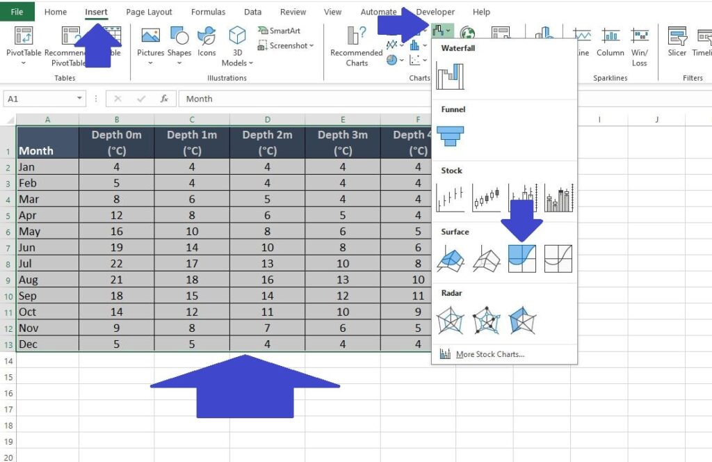
Below is a peek at the data I’ve collected. You can check it out by copying it into Excel, or make things easier by downloading the full file with a click.
Data Download and Preparation
The first step is to organize your data in a grid format with X and Y coordinates and corresponding Z values.
For this example the X and Y coordinates are ‘Month‘ and ‘Depth‘ respectively. The ‘Temperature‘ is our Z value.
You can copy and paste this table direct into Excel cell A1 (or download the sample data file by clicking the download button below):
Download Fishing Lake Temperatures in Excel| Month | Depth 0m (°C) | Depth 1m (°C) | Depth 2m (°C) | Depth 3m (°C) | Depth 4m (°C) |
| Jan | 4 | 4 | 4 | 4 | 4 |
| Feb | 5 | 4 | 4 | 4 | 4 |
| Mar | 8 | 6 | 5 | 4 | 4 |
| Apr | 12 | 8 | 6 | 5 | 4 |
| May | 16 | 10 | 8 | 6 | 5 |
| Jun | 19 | 14 | 10 | 8 | 6 |
| Jul | 22 | 17 | 13 | 10 | 8 |
| Aug | 21 | 18 | 16 | 13 | 10 |
| Sep | 18 | 15 | 14 | 12 | 11 |
| Oct | 14 | 12 | 11 | 10 | 9 |
| Nov | 9 | 8 | 7 | 6 | 5 |
| Dec | 5 | 5 | 4 | 4 | 4 |
Insert a Contour Chart
With our data organized the next step is to create the initial Contour Chart in Excel. To do so follow these simple steps:
- Highlight your data.
- Click on the ‘Insert‘ tab on the Excel Ribbon.
- Within the ‘Charts‘ section of the Ribbon Click on the option called ‘Insert Waterfall, Funnel, Stock, Surface or Radar Chart‘
- Choose ‘Contour Chart’ from the options (found in the ‘Surface‘ section).
Customizing Your Contour Chart
Creating the first contour chart in Excel is straightforward once your data is neatly organized and ready.
However, there’s always room to enhance what Excel initially offers:
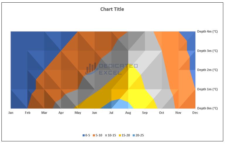
When you first generate a contour chart in Excel, there are a few areas that usually need some tweaking:
- Series Ordering: Our chart aims to show temperature changes at different lake depths over the year.
It’ll be more intuitive if we arrange it with the surface (0m) at the top and the lake bed (4m) at the bottom. - Series Colors: Since we’re dealing with temperatures, a color range from blue (cold) through orange to red (hot) would be more representative.
The default colors chosen by Excel don’t quite capture this temperature progression as effectively as they could. - Missing Label: We’ll also need to add a ‘Chart Title’ for clarity, making it immediately apparent what our contour chart in Excel is depicting.
Customizing contour charts in Excel can be different from other Excel charts.
Let’s go through each of these adjustments step-by-step, so you can apply them to your own data effectively.
Series Ordering
Let’s start by rearranging the order of the series in our chart.
Typically, many Excel charts offer a handy ‘reverse series order‘ feature, but this isn’t available for contour charts, as they blend the series together. So, we need to manually adjust the order.
Thankfully, you don’t have to alter your original dataset. Here’s how you can reorder the series directly in the chart:
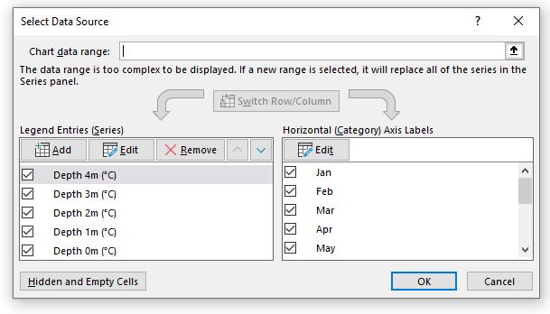
- Right-click on your contour chart and choose ‘Select Data‘.
- In the ‘Legend Entries (Series)‘ section, you’ll find each series listed.
- Use the up and down arrows to rearrange these series. The idea is to start with the deepest part of the lake (4m) and move upwards in decreasing depth order.
This adjustment will ensure that your chart reflects a more logical depth progression, from the lake bed upwards.
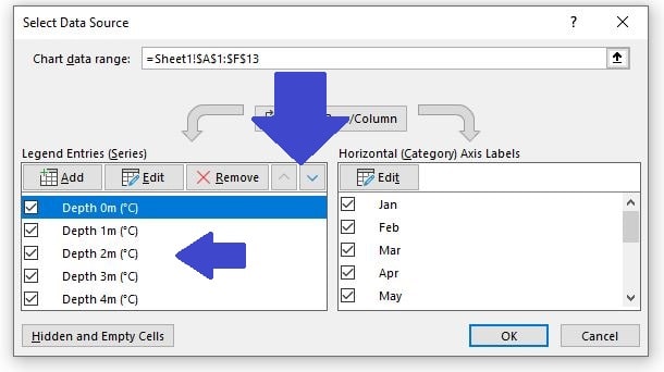
When you have finished re-ordering the ‘Legend Entries (Series)‘ it should look like this:
The series order in our Contour Chart now more accurately represents our data.
The temperatures are displayed as they occur in the lake: with the surface (0m) at the top of the chart and the lake bed (4m) at the bottom.
This arrangement mirrors the real-world structure of the lake, making the chart more intuitive and easier to understand:
Series Color Changes
Next on our list of customizations is to change the color scheme to reflect heat and temperature changes better.
As mentioned previously, Contour Charts in Excel are different, we are not able to edit an individual series color like you can on most other Excel charts.
There are 3 ways to approach this depending on your requirements:
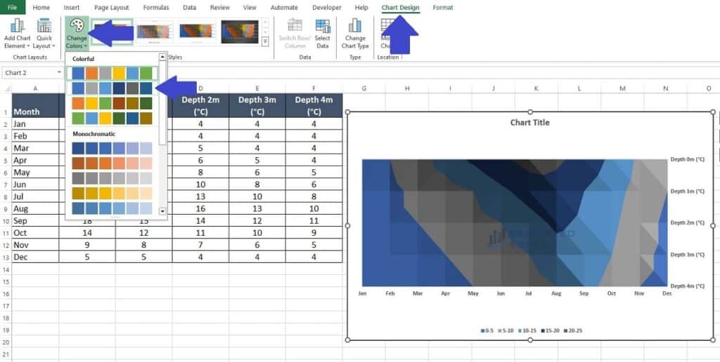
Method One – Change Chart Color Scheme
- Click anywhere on the Contour chart then select ‘Chart Design‘ from the Excel Ribbon.
- Within the ‘Chart Styles‘ section select the ‘Change Colors‘ option and choose a different style to suit your requirements.
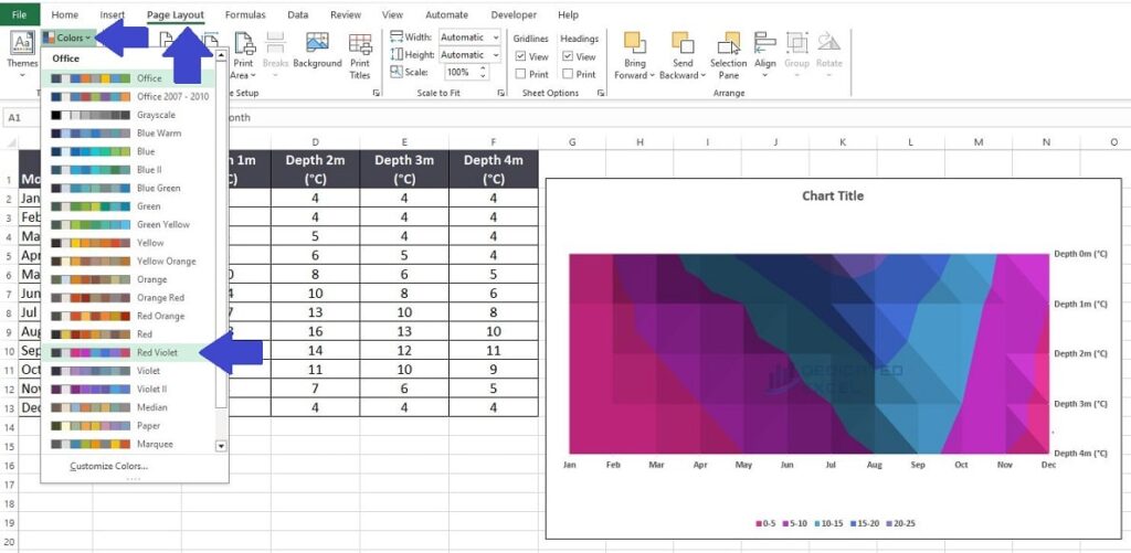
Method Two – Change Page Layout Color Scheme
- On the Excel Ribbon select the ‘Page Layout‘ tab.
- Change the ‘Colors’ section to suit your requirements.
Note that this change will apply to the entire page so if you have specific colors in cells they might change along with the chart.
Method Three – Create Your Own Color Scheme
The last method to change the color scheme for your Contour Chart in Excel is to create your own unique color scheme.
This method requires a bit more effort and possibly some trial and error in selecting the right colors but ultimately gives you complete control over how your chart looks.
First navigate to the ‘Page Layout‘ tab on the Excel ribbon and open the ‘Colors‘ menu as in method two.
This time select the option called ‘Customize Colors‘, which will open the ‘Create New Theme Colors‘ properties box.
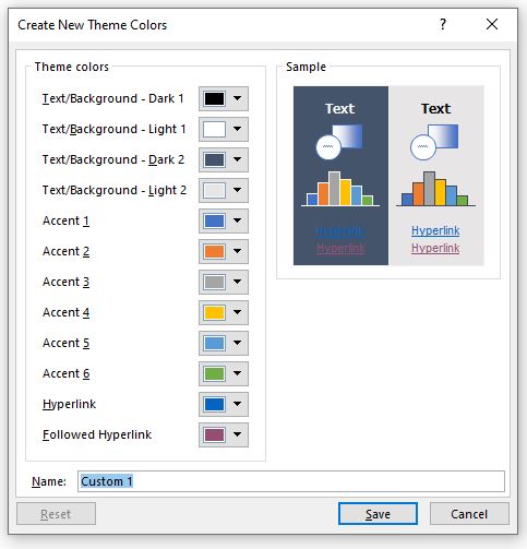
The next step is to specify custom colors for each of the Accent Colors that apply to your Contour Chart.
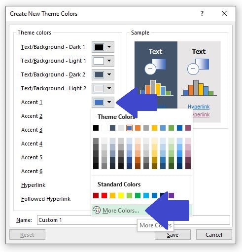
Click on the arrow adjacent to the Accent Color and either select a new color from the ‘Color Palette‘ or specifying the color by selecting the ‘More Colors‘ options:
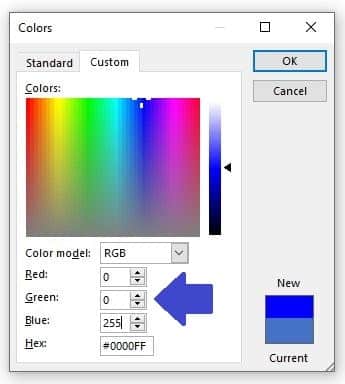
For this example we have 5 accents (0m, 1m, 2m, 3m and 4m in depth).
So we’ll apply a custom color to each accent this way using the RGB color method:
- Accent 1 (Coldest): Use a deep blue to represent the coldest temperatures.
RGB(0, 0, 255) – Deep Blue
- Accent 2: Transition to a lighter blue, indicating slightly warmer temperatures.
RGB(102, 178, 255) – Light Blue - Accent 3: A neutral color that signifies a moderate temperature.
RGB(255, 255, 0) – Yellow - Accent 4: Now transitioning to warm, use a light red.
RGB(255, 153, 51) – Orange - Accent 5 (Warmest): A deep red to represent the warmest temperatures.
RGB(255, 0, 0) – Red
These colors should provide a smooth transition from a cold to a warm temperature range.
The deep blue and red mark the extremes, while the intermediate colors show the transition through the spectrum.
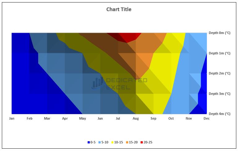
Chart Labels
We have almost finished customizing our Contour chart in Excel.
Let’s update the title and change the layout slightly to finish everything off neatly and professionally.
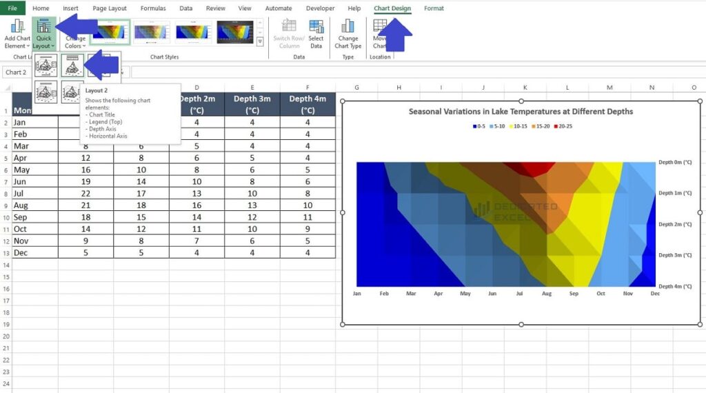
- Click on the ‘Chart Title‘ and edit the text to ‘Seasonal Variations in Lake Temperatures at Different Depths‘.
- With the chart selected choose the ‘Chart Design‘ tab on the Excel Ribbon and then Change the ‘Quick Layout‘ to ‘Layout 2‘ this will move the legend to below the Chart Title making it more apparent to users.
Analysing and Interpreting the Contour Chart
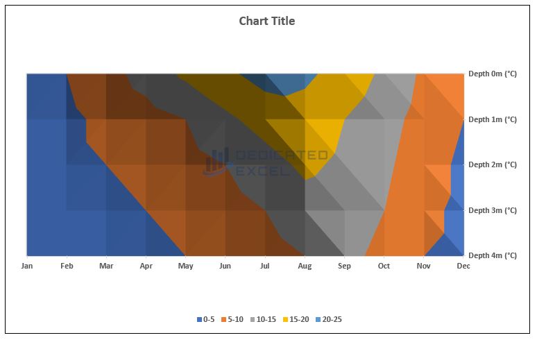
We have now created a Contour Chart in Excel, fully customized to show Seasonal Variations in Lake Temperatures at Different Depths.
Let’s analyse what this chart tells us:
- The deep blue areas, predominantly visible in the outer edges of each month’s data, especially during winter months (January, February, November, December), represent the coldest temperatures at all depths.
- Light blue signifies slightly warmer temperatures. This color becomes more prominent in the transitional months of March and October, indicating a moderate increase in temperature, particularly at shallower depths.
- Yellow regions appear more significantly around the mid-year months (April to September), marking moderate temperatures.
This is particularly noticeable at the lesser depths, suggesting that the surface and near-surface waters warm up more than the deeper areas. - Orange and red hues dominate the summer months (June, July, August), particularly in the upper layers of the lake, illustrating the highest temperatures of the year.
The chart clearly shows a gradient of colors shifting from blues in winter to oranges and reds in summer, then back to blues in winter.
This color transition reflects the thermal stratification in the lake, with surface waters experiencing more significant temperature fluctuations than the deeper, more thermally stable zones.
Overall, the contour chart is an excellent demonstration of how temperatures in a lake do not change uniformly with depth.
The stratification is visually captured, showcasing how surface temperatures are more susceptible to seasonal changes, while deeper waters maintain a more constant temperature.
Additional Tips for Contour Charts in Excel
For those looking to further refine their contour charts in Excel, here are some additional tips that can elevate your charts from good to great:
Accurate Data Organization
- Ensure your data is properly structured for a contour chart.
- The data should typically be in a grid format, with one axis (X or Y) representing categories (like time or location) and the other showing variables (like temperature or pressure).
- Double-check your data for any inconsistencies or missing values, as these can significantly impact the accuracy and readability of the chart.
Selecting an Appropriate Color Palette
- Choose a color palette that not only looks visually appealing but also makes sense for your data.
For instance, use cooler colors like blues for lower values and warmer colors like reds for higher values. - Consider color-blind friendly palettes, especially if your chart will be used in public presentations or reports.
Tools like ColorBrewer offer palettes designed for accessibility.
Effective Labelling and Legends
- Clear labelling is crucial. Label each axis and include units of measurement to provide context to your data.
- Customize the chart legend to make it more informative.
Ensure that the legend clearly corresponds to the color gradients on your chart, making it easy for viewers to understand the data at a glance.
Chart Scale and Limits
- Pay attention to the scale of your chart. Setting appropriate minimum and maximum values can help in better representing the variations in your data.
- If your data has outliers or extreme values, consider how these might skew the visualization and adjust the scale accordingly.
Testing Different Chart Types
- Sometimes, a contour chart might not be the best option.
If the data doesn’t seem to be clearly represented, experiment with other types of charts like heatmaps or 3D surface charts.
Summary
Mastering the contour chart in Excel is a game-changer for anyone dealing with data.
It’s more than just a tool; it’s a way to bring clarity and insight to complex information.
With a contour chart, you can transform intricate data sets into clear, engaging visuals that tell a story. It’s about making data accessible and understandable, helping you to spot trends and patterns with ease.
As you add this skill to your Excel repertoire, you’re not just improving your presentations; you’re sharpening your ability to make sense of data in a way that can truly make a difference.
Embrace the power of a contour chart in Excel and watch your data analysis reach new heights.
Keep Excelling,

As you’ve just unlocked the fascinating world of contour charts in Excel, why stop there? Embark on your next adventure in data visualization by exploring our next post, Unlock the Secrets of 3D Charts in Excel.
Dive deeper into the realm of Excel and discover how 3D charts can transform your data into stunning, multi-dimensional visual masterpieces.