Are you looking to enhance the interactivity of your Excel charts? Learn how to create an Excel chart with a scroll bar, a feature that not only elevates your data presentation but also makes it dynamically engaging.
This guide will walk you through the steps of integrating a scroll bar into your charts, empowering you to present large data sets in a compact and interactive format. Whether you’re preparing a report or analysing trends, mastering this skill will transform your Excel experience.
Why Add a Scroll Bar to an Excel Chart?
Adding a scroll bar or slider to an Excel chart significantly enhances user interactivity, particularly for charts displaying extensive data over long intervals or time periods.
This feature allows users to focus on specific data segments that are most relevant to them, offering a tailored analytical experience.
As an Excel analyst, this approach not only saves time by reducing the need to create multiple charts but also delivers a professional, adaptable solution that meets diverse client needs more effectively.
To prove this concept the example this guide will use looks at producing a chart off the back of 48 months of sales data.
A basic Excel Chart covering this time frame would look something like this:
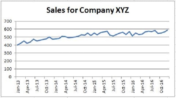
This chart shows the sales trend over 48 months, but it’s not easy to use if you don’t make it really wide, and making it too wide isn’t a good idea!
If you need to look at specific parts of the data, like if there were 120 months or daily sales for a few years, it’s really hard to see the details you need.
The chart just isn’t user-friendly for digging into a lot of data points.
Consider for our example of 48 months if we look at the same chart but just with 12 months in view:
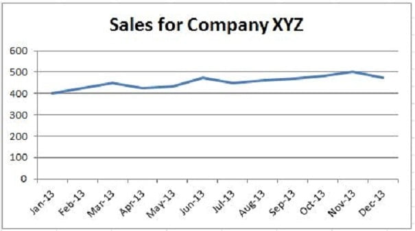
As you can see each of the 12 months has a clear data point on the chart which will make analysing the sales easier for the end-user, and usability is a key factor a good analyst should consider when producing winning Excel Dashboards or reports.
Creating an Excel Chart with a Scroll bar
For this example you can download the Excel file from here. It will help you follow the walk-through if you can see everything in Excel and I would advise you to take a look even if you plan to just read the guide or create your own data to work on.
Alternatively you could copy the original data from the Data worksheet in the download file and recreate the Excel chart with a scroll bar using this guide.
Remember that this is all an example and everything that is covered can be customised and tailored to suit your individual requirements, this guide is aimed at teaching you the basic principles of how to add a slider or scroll bar to a chart in Excel.
Step One: Define the Aim
Knowing the aim of a task is always crucial, you can’t begin your journey without knowing your destination! For this example the aim is to take 48 months of sales data and produce an Excel chart with a scroll bar. The end chart will show 12 months of sales data in view at all times and allow the user to scroll through and move the date period on one-month at a time.
Step Two: Arrange your Excel Workbook
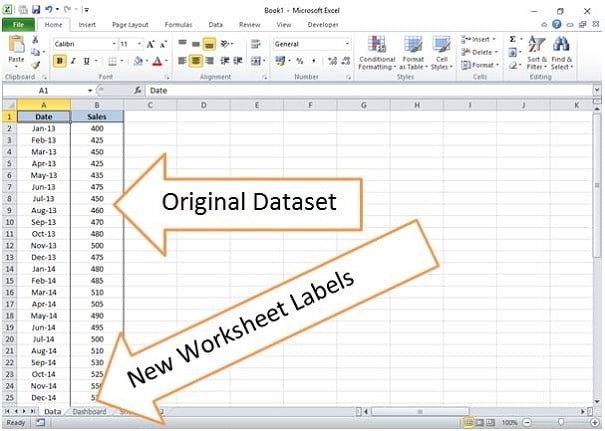
To make things clear the original dataset containing 48 months of sales data is placed on a worksheet called Data. Column A contains the Date Period and Column B contains the corresponding Sales Value for that Date Period.
In addition to the Data worksheet another Worksheet is labelled as Dashboard and this is where the chart and 12 month data table will go when created.
Step Three: Set up the Dashboard Worksheet
To produce a scroll bar on an Excel chart we must take a subset of the data and produce a chart against that subset. The subset will automatically recalculate when the scroll bar position is changed. Taking this into consideration we need to know the following:
- The Date Value from the Subset
- The corresponding Sales Value from the Subset
- The position of the scroll bar
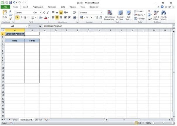
For this example the aim is to chart 12 months of data at all times so we need to create a table for those 12 months to go in.
We also need a reference cell that will capture the position of the scroll bar.
Working on the ‘Dashboard’ worksheet:
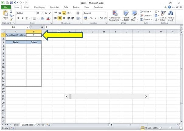
- Cell A1 is the text “Scroll bar Position“, the position will be captured in Cell B1 next to it.
- Cell A3 and B3 are the headers for our data table and to make things neat and tidy I have boxed around 12 cells below that (down to A15 and B15).
This makes sure I remember to capture the full 12 months which was part of the aim.
Step Four: Add the Scroll Bar
The next step is to add the Scroll Bar to the Dashboard Worksheet.
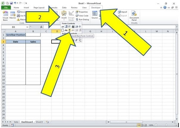
- Click on the Developer tab on the Excel Ribbon
- Click on Insert within the Developer tab
- Click on Scroll Bar within the Insert box
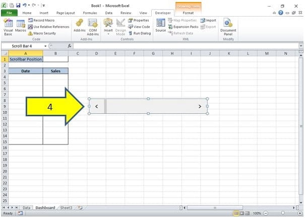
- Draw a Scroll bar on the Dashboard Worksheet by holding down the left mouse button and dragging across. Make it a reasonable size to begin with as you can always resize when you complete any final tidying up at the end.
No Developer Tab? If you do not have the Developer tab showing then you can add this via Excel Options in a seconds, this post here will show you how.
Step Five: Set the Scroll Bar Control Options
Right-Click on the Scroll Bar and select Format Control from the pop-up box. This will open the Format Control options box, ensure you are on the tab called Control:
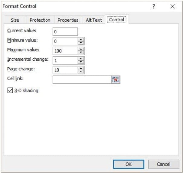
Note about Increments: The controls for a scroll bar work in Increments. Each click of the scroll bar will move the increment up or down depending on the way you scroll.
With the Control tab we will need to change the values, do so as follows:
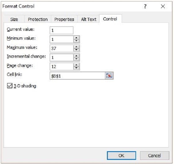
- Current Value: This is the current increment value and will generally be set to 1 for any work that you do. Set this to a value of 1.
- Minimum Value: This is the lowest increment number in the dataset, again it will often be 1. Set this to a value of 1.
- Maximum Value: This is the maximum increment number in the dataset so logic would dictate that with 48 months it would be set to 48 however this is where we need to take a step back and think.
The aim is to show 12 months of data at all times on the chart.
If we allow a user to scroll to position 48 that will be the 48th month in our dataset, there is no more data after that point so the chart would end up showing 1 month of data followed by 11 blank positions, not what we want.
To get around this problem we can use a simple equation to calculate what the maximum allowed increment should be:
- Maximum Value = Total no. of increments – (No. of increments to display on chart – 1)
Applied to this example we have 48 increments and want to display 12 increments at all times on the chart, therefore the equation is:
- Maximum Value = 48 – (12 – 1)
Therefore set the Maximum Value to 37.
- Incremental Change: This is the number of increments the scroll bar will move with each click. Set this to a value of 1.
- Page Change: This is the number of increments that will be shown on that chart. Set this to a value of 12.
- Cell Link: This has to be a blank cell on your worksheet, it is where the current increment value will be captured so that you can use it in your formulas to display the right data.
Set this to $B$1 as we have already prepared a blank cell for it in step three of the process.
When you have set all the values as quoted above, the options box should look like the below image. If all is correct click on OK.
After you have clicked OK you will see the Dashboard worksheet in full again. Notice that cell B1 has now been populated with the value 1.
If you move the scroll bar right or back left you can see this value change depending on what increment you move the scroll bar to.
Step Six: Populate the 12 month subset data table
With the scroll bar created and options set it is time to populate the 12 month data table. Let us consider what we are trying to achieve.
We need the table to contain 12 dates and their corresponding sales value from the Data worksheet, which is the original source, and the 12 months of data must start depending on what increment the scroll bar has been scrolled to.
If for example the scroll bar has been moved to increment number 12 then we need our subset data table to start taking values from the the 12th row of the original source.
This is why the scroll bar selection value in cell B1 of the Dashboard worksheet is important, we can use that to tell Excel what row to start picking up data from.
To lookup values from original data range and based on a row number we can use the INDEX function. The INDEX function takes the format:
- =INDEX(Array, Row Number, [Column Number])
Note that because the Column Number is in square brackets it means this is an optional argument in the function, we do no need it for this example, we just need the row number.
On the Dashboard worksheet select cell A4 as this is the first cell in the subset data table. In cell A4 type the following formula:
- =INDEX(Data!A2:$A$49,Dashboard!$B$1)
What this is telling Excel is the Array, or range of data we want to use, is on the Data worksheet in cells A2 to A49 and the Row Number we want to use for the is on the Dashboard worksheet in cell B1.
We do not lock cell A2 (no dollar signs) as when the formula is dragged down the remaining cells we want that reference to move, this is how we will pick up all 12 months in the table.
When you have entered the formula drag it down the remaining blank cells in the subset table, you should see Jan-13 to Dec-13 populated in the cells.
Note: To drag down a formula into the adjacent cells left-click on the lower right corner of the cell, keep the mouse button pressed down and drag the cursor down the cells in question. This will copy the formula.
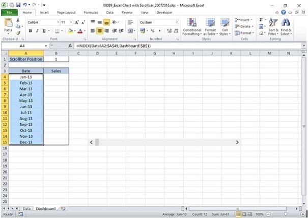
Note: The dates may not show in MMM-YY format if you have started this process from new instead of using the downloadable file. This is simply a formatting issue that can be resolved by highlighting the date cells in A4 to A15 and creating a custom format of MMM-YY.
When you have completed the dates the process can be repeated for the corresponding sales values. In Cell B4 of the Dashboard worksheet enter the following formula:
- =INDEX(Data!B2:$B$49,Dashboard!$B$1)
Notice the only change is that in this instance we refer to the sales values that can be found in cells B2 to B49 of the Data worksheet. Again drag this formula down and you will be left with a fully populated 12 month subset table on the Dashboard worksheet.
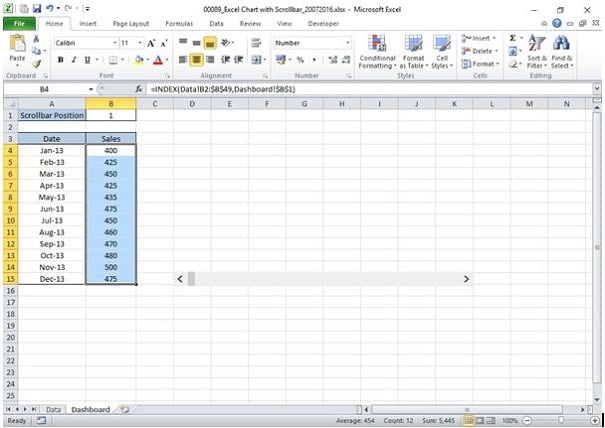
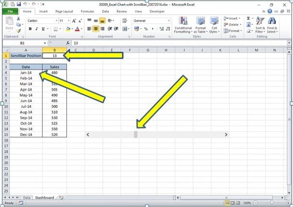
The subset table containing 12 months of data is now complete. You can check everything is working properly by scrolling on the scroll bar. Move it to position 13 (check cell B1 on the Dashboard worksheet shows the value 13 after scrolling to the right) and you will notice that the table has rolled on to show values of Jan-14 to Dec-14.
Step Seven: Create a Chart from the Subset Table
Now that the scroll bar is complete and the subset data table is populated correctly you can move onto to creating a chart using the subset data table. If you have made it this far though my guide it is my guess you are experienced enough with Microsoft Excel to already know how to create a chart but just in case you can review one of my previous guides on how to create an Excel chart.
By using the subset data table to create the chart it means that the Excel chart will automatically change when the subset data table changes, and that changes when the scroll bar is changed so everything works in conjunction to give you an Excel Chart with a Scroll bar…the original aim is achieved.
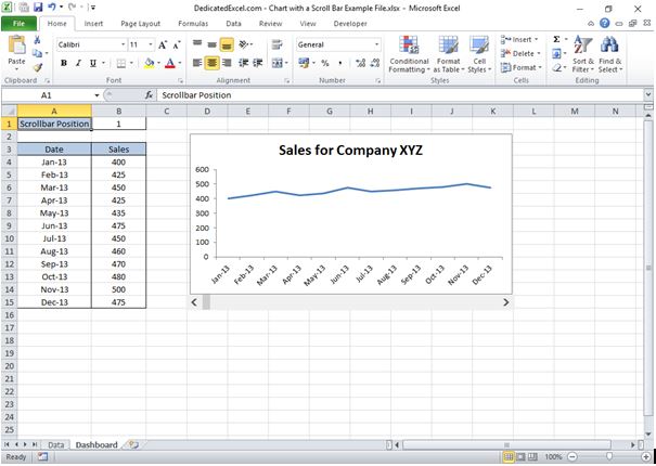
As with all things Excel there are many enhancements you can make to the chart. A few things you might consider:
- Hide the scroll bar position cell or place on a separate worksheet to the chart. There is no need for the end-user to see this and you would not want them overwriting the cell, if this stays in view then make sure you lock the cell and protect the worksheet to prevent changes.
- Move the subset data to another worksheet or hiding. When you are creating detailed Excel Dashboards the space you have available, often referred to as real estate, is always at a premium and the Excel chart with a scroll bar is usually enough information to show.
- Dynamic ranges and titles are useful if your dataset will continue to grow on a regular basis. In the long-run it will save you a lot of time especially if you have multiple charts and tables in a Dashboard. You can read more about Dynamic ranges here.
Summary
In summary, adding a scroll bar to an Excel chart not only enhances its visual appeal but also makes it more functional, especially for large data sets.
This guide aimed to simplify the process, empowering you to create dynamic, interactive charts.
Whether for presentations, reports, or analysis, mastering this skill can significantly upgrade your Excel proficiency.
Keep Excelling,

Great job! Now it’s time to enhance your Excel charts even further. Check out this next post on how to create a goal line on a chart to ensure you never miss those objectives again!

