
Have you ever wanted to plot two different types of data on the same Excel chart but found yourself struggling to make sense of it all? Perhaps you’ve tried comparing sales figures with the number of products sold, only to end up with a jumbled and confusing chart. The solution to this common dilemma lies in using a chart with two Y-axes, also known as a dual Y-axis chart or a combination chart.
In this post, we’ll guide you through the process of creating a two Y-axes chart in Excel, showing you how to effectively display and compare distinct datasets in a single, clear visualization.
What is an Excel Chart with Two Y-Axes?
An Excel chart with dual Y-axes, often referred to as a dual Y-axis chart or a combination chart, is an advanced chart designed for detailed data analysis. This format allows for the concurrent plotting of two distinct data sets within a single chart, each utilising its own vertical scale.
For example, one axis could display financial metrics such as revenue, while the other axis represents related data, like the number of units sold. This structure provides a powerful tool for business professionals to analyse and visualize complex relationships between different but related data sets in a clear, concise manner.

Step One – Get Organised
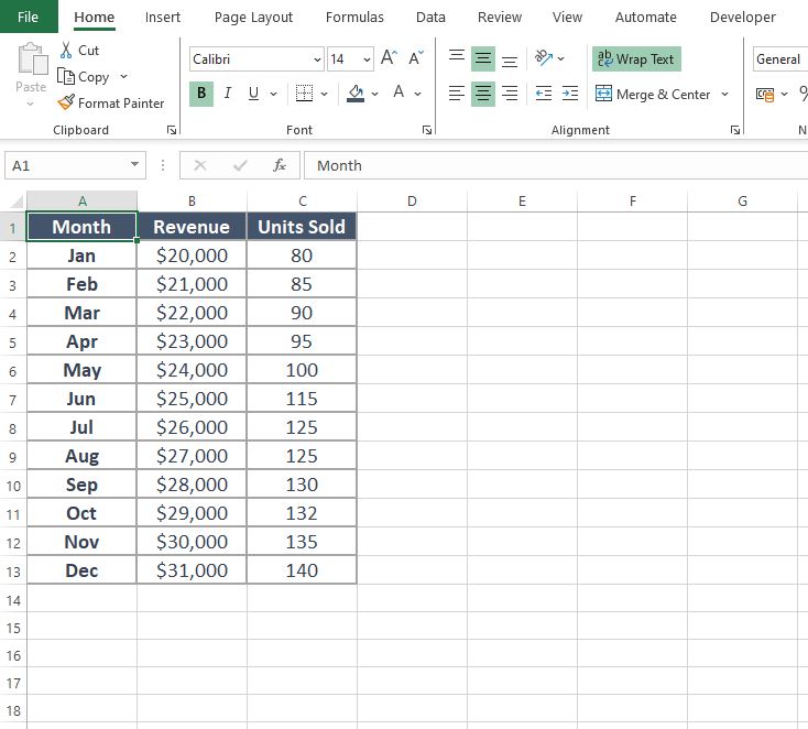
Before diving into the creation of a dual Y-axis chart in Excel, it’s crucial to organise your data effectively. You’ll need three key sets of data, with one set acting as a common link between the other two. Here’s a simple way to think about it:
- Primary Data Set: This is your main set of data. For instance, it could be monthly sales figures.
- Secondary Data Set: This set is what you want to compare against the primary data. It could be something like the number of units sold each month.
- Common Link Data Set: This is a set that applies to both primary and secondary data sets, often a time period like months or quarters.
Arrange these data sets in your Excel sheet in a clear and structured manner. The common link data set typically goes on the far left column, with the primary and secondary data sets following it. This layout ensures clarity and ease when you start creating your dual Y-axis chart.
Remember, well-organised data is the foundation of a successful and insightful chart.
Step Two – Create the Chart
With your data organised in the correct fashion we can proceed with creating the chart.
- Highlight your data (including the headers), for this example its the data in cells A1 to C13.
- Click on ‘Insert‘ on the Excel ribbon then in the sub-section called ‘Charts‘ select the option for ‘Combo’, select the first chart.
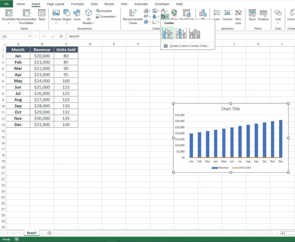
Step Three – Format the chart series
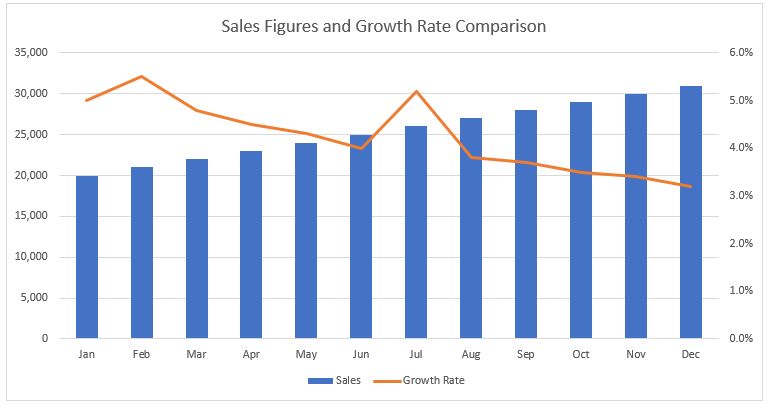
The combo chart is created but not quite right yet. We need to convert the Secondary Series, in this example the Units Sold, to have its own Y-Axis. At the moment it is still plotted against the Monthly Sales, hence the reason the orange line representing it goes across the bottom of the chart.
- Right-click on the secondary charts series (expand the chart size if needed to make selection easier).
- Select ‘Change Series Chart Type’ from the options box.
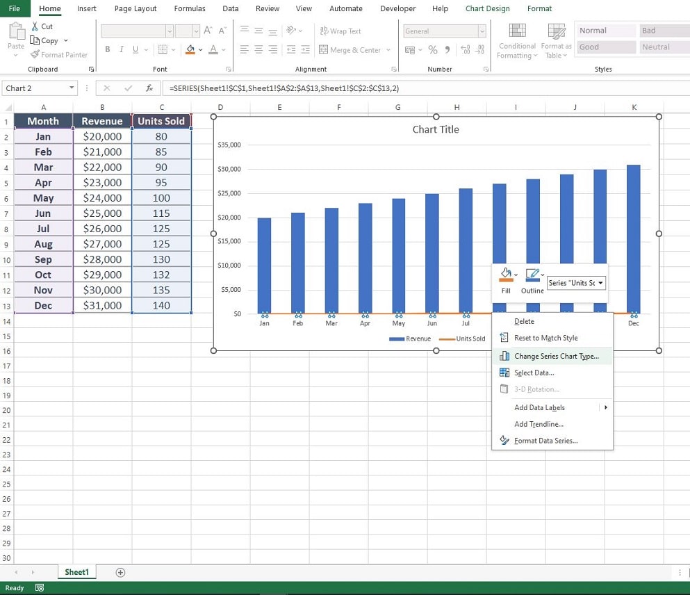
You are presented with the ‘Change Chart Type‘ options box.
- Check the box next to the series plotted on the line (in this example the units sold) called ‘Secondary Axis’
- Click ‘OK‘
Note that you can see your adjustments in the viewer window, this enables you to double check you have the right options set before you click ‘OK‘.
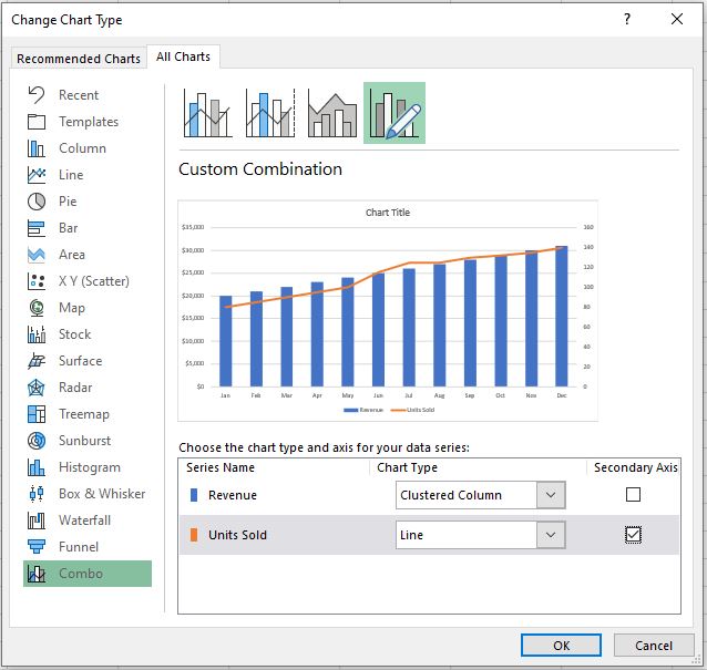
After clicking OK’ the Excel Chart with two y-axes has been created. All that is required are any additional formatting changes you wish to make like changing colour schemes, fonts or inserting chart titles and legends.
Tips for Chart Perfection
Creating a perfect dual Y-axis chart in Excel is an art that balances clarity with information. It’s not just about presenting data; it’s about doing it in a way that speaks clearly and effectively to your audience. Keep these key tips in mind to elevate your chart from good to great:
- Avoid the Clutter: Keep it simple. Overloaded charts lose their punch. A clutter-free chart is not only aesthetically pleasing but also makes it easier for your audience to understand the data being presented.
- Scale Wisely: Inconsistent scales can mislead. Keep them honest. Ensure that the scales you use for both sets of data are appropriate and do not distort the information you are trying to convey.
- Colour Matters: Use distinct colours for each data series. It’s not just about looking good; it’s about clarity. Different colours help differentiate data sets at a glance, making your chart more intuitive and user-friendly.
Remember, the goal of your chart is to convey information in the most straightforward and impactful way possible. After crafting your chart, take a step back and view it as if you were seeing it for the first time. Does it communicate your message effectively? Is it easy to understand? A well-designed chart not only delivers data but also tells a story – make sure yours tells the right one.
Summary
Creating an Excel chart with two Y-axes is not just a skill but an essential tool in the world of data analysis and presentation. It offers a unique and impactful way to visually compare and contrast different data sets, providing a deeper understanding of their relationships. When used judiciously, this feature can significantly enhance your data presentations, allowing for more nuanced insights and a clearer understanding of complex information.
However, it’s important to approach this tool with a sense of balance and responsibility. The goal is to enlighten your audience with clarity and precision, not to overwhelm or mislead them with overly complex visualizations. By mastering the dual Y-axis chart, you equip yourself with a powerful means to tell a compelling story with your data, making your analysis not only informative but also engaging.
Keep Excelling,

While you are brushing up on your charting skills check out this excellent post on how to create a goal line on your Excel charts. A crucial skill for all data analysts.