
Learning How to Add a Trendline to an Excel Chart is a fantastic skill for every data analyst to have. Microsoft Excel offers a powerful tool to visualize and interpret data trends through its various trendline options so whether you’re a stock market analyst, a marketer analysing sales data, or a scientist measuring environmental changes, Excel’s trendlines can provide invaluable insights.
In this post we’ll cover How to Add a Trendline to an Excel Chart and much more, in fact we’ll cover everything you could possibly want to know about trendlines in Excel!
- How to Add a Trendline in Excel
- The Trendline options available in Excel
- Forecasting your Trendline in Excel
- Advanced Forecast Option in Excel
- Set Intercept feature
Understanding Trendlines in Excel
A trendline is a graphical representation that shows the underlying trend in a dataset. It helps in forecasting and analysing patterns over time. Excel provides several types of trendlines, each suitable for different data types and analysis needs.
How to Add a Trendline to an Excel Chart
The first step in understanding trendlines in Excel is learning how to add a trendline to an Excel chart. The best method is by example so let’s jump right in and create an Excel chart and add a trendline.
Step One – Create a chart
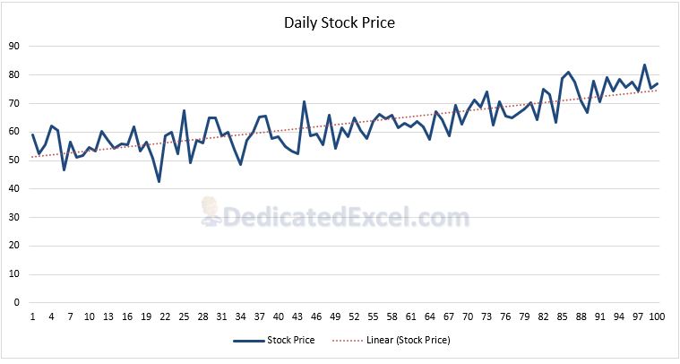
- Highlight your data. No data? Download 100 Days of a Stock Price here.
- Go to the ‘Insert‘ tab on the Excel Ribbon and click on ‘Insert Line or Area Chart‘ and select ‘Line Chart‘, this will create a chart based on your selected data.
- If you need help on this step please review our guide on creating a chart in Excel.
Step Two – Add a Trendline
- Click on the line in the chart to select it.
- Right-click and choose ‘Add Trendline‘ from the context menu.
- In the ‘Format Trendline‘ pane that appears on the right, under ‘Trendline Options‘ select the option called ‘Linear‘. You can then close the pane.
- The Linear Trendline has been added to the chart (represented by a red line in our example, note your default colours may vary).
Trendline Options in Excel
You might have noticed there were multiple trend options available in ‘Format Trendline‘ pane. In total there are six different types of trends that you can select. Each of the trends serves a different purpose so learning which one will best-fit your data is crucial to deploying an effective trendline strategy in Excel. Let’s look at the main types:
Linear Trendline
The Linear Trendline shows a straight line that best fits the data points. It’s the most straightforward type of trendline, used for simple linear data sets such as stock prices or average temperatures over time.
- When to use this option: Use a linear trendline when you have data that shows a constant rate of change. It’s ideal for datasets where the increase or decrease is consistent over time.
- Real-World Examples:
- Identifying the trend in stock prices over time.
- Analysing average temperature changes year over year.
- Tracking consistent sales growth or decline across several periods.
- Factors to Consider: Consider the linear trendline when your data does not show significant fluctuations or curvature. It is not suitable for data that exhibits exponential growth, seasonal variations, or more complex patterns.
Exponential Trendline
The Exponential Trendline is best suited for data that rises or falls at increasingly higher rates. It represents data that grows or decays at a proportionate rate, such as population growth.
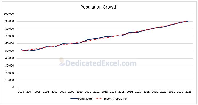
- When to use this option: Use an exponential trendline for data showing exponential growth or decay, such as population growth or radioactive decay (eek!)
- Real-World Examples:
- Projecting population growth over time.
- Modelling the rapid spread of a viral video online.
- Estimating the decay of a radioactive substance.
- Factors to Consider: This trendline is appropriate when your dataset shows that the rate of change increases or decreases rapidly and then stabilizes. It’s not ideal for data with a constant rate of change or simple linear patterns.
Logarithmic Trendline
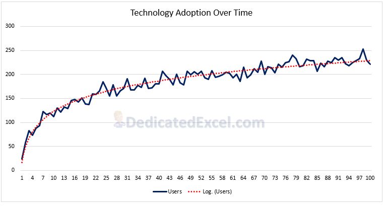
The Logarithmic Trendline is ideal for datasets where the rate of change decreases rapidly and then levels off. It’s represented by a logarithmic curve, typically used in datasets that quickly increase or decrease and then stabilize.
- When to use this option: Opt for a logarithmic trendline when your data initially changes rapidly but then the rate of change decreases. It’s suitable for phenomena that initially have a burst of activity that slows over time.
- Real-World Examples:
- Modelling the early rapid adoption phase of new technology or product.
- Analysing the rate of chemical reactions over time.
- Understanding the initial rapid growth of a start-up company’s revenue.
- Factors to Consider: This trendline is not suitable for negative or zero values. It’s best used for datasets that show a rapid initial change followed by a stabilization. It’s important to ensure that the logarithmic model truly fits the nature of the data and is not just a convenient mathematical fit.
Polynomial Trendline
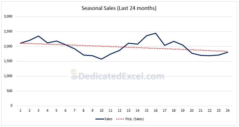
The Polynomial Trendline is useful for more complex data sets with multiple fluctuations. It can fit a wide range of curves and is represented by a polynomial equation.
- When to use this option: Opt for a polynomial trendline when your data shows variations and curvatures, such as seasonal trends or economic data fluctuations.
- Real-World Examples:
- Analysing seasonal sales patterns in retail.
- Studying the fluctuating unemployment rates over several years.
- Examining variations in environmental data like temperature or rainfall.
- Factors to Consider: You can change the order of the polynomial (degree) in the ‘Format Trendline‘ pane, next to the ‘Polynomial‘ Trendline Option. Increasing the degrees can fit more fluctuations (ups and downs) in the data but be wary about overfitting. It’s easy to get caught up trying to fit the trendline too exactly to the data. By getting overly lost in the details of every up and down you can lose sight of the bigger picture your data is telling you.
Power Trendline
The Power Trendline is ideal for data where the response variable changes as a power function of the predictor variable. It’s used in scientific data analysis.
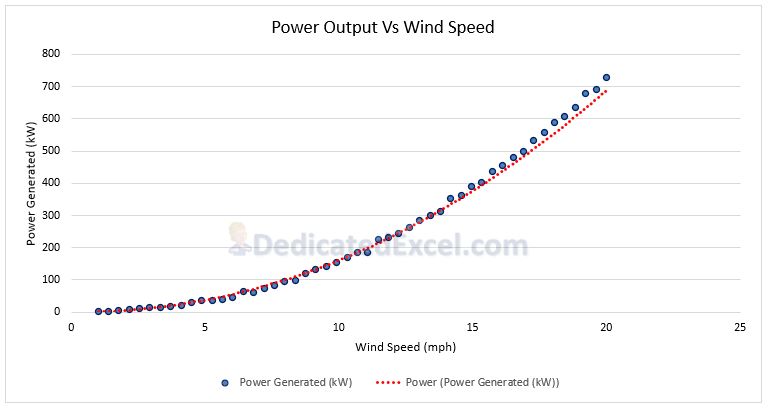
- When to use this option: Use a power trendline when one variable is a specific power of another, such as wind speed’s relation to power generated by a wind turbine.
- Real-World Examples:
- Relating wind speed to the power generated by wind turbines.
- Modelling the intensity of sound relative to the distance from the source.
- Analysing the relationship between pressure and volume in chemistry.
- Factors to Consider: Ensure that both variables are positive since the power function cannot handle negative values. This trendline is not suitable for datasets that do not follow a power law distribution.
Moving Average Trendline
The Moving Average Trendline helps smooth out short-term fluctuations in data and highlights longer-term trends. It’s particularly useful in financial data analysis.
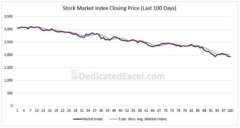
- When to use this option: Utilize a moving average trendline to filter out noise and see the underlying trend more clearly in datasets like stock market indices.
- Real-World Examples:
- Smoothing out short-term fluctuations in a stock market index.
- Analysing trends in daily average temperatures.
- Understanding consumer price index variations over time.
- Factors to Consider: You can change the period of the moving average ( (e.g., 5-day, 30-day) in the ‘Format Trendline‘ pane, next to the ‘Moving Average‘ Trendline Option. A shorter period is more sensitive to daily fluctuations, while a longer period smooths out more of the noise
Trendline Name
Also found the in the ‘Format Trendline‘ pane is a section where you can assign a custom name to your trendline. This is reflected in the chart’s legend.
As standard the Trendline name will appear as the trend type used followed by the series the trend belongs to, i.e. “Linear (Stock Price)”. If you want to customise this name select the radio button called ‘Custom‘, and then enter your desired title in the adjacent text box.
Forecasting Trends in Excel
Understanding the trend is useful but predicting where things are going next is even more powerful!
The Forecast option in Excel allows you to extend your trendlines into the future (forecast forward) or into the past (forecast backward), enabling you to provide predictions based on your existing data. This feature is particularly useful for analysing trends and making projections.
To access these options click on your trend line so the ‘Format Trendline‘ window appears on the right of the screen.
In the ‘Forecast‘ section adjust the number of periods (either Forward or Backward) to forecast on the chart. For example if we have 100 days of stock prices we might choose the forecast 15 days into the future.
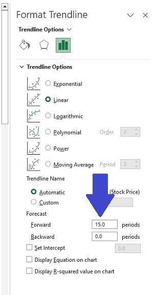
The period is dependent on your data’s time frame – days, months, years, etc. After entering the number of forecast periods the chart will update and you can close the ‘Format Trendline‘ Pane down.
How the Forecast is Calculated?
Excel calculates the forecast based on the existing trend in your data. For a linear trendline like above, it extends the line using the same slope calculated from your data. For other types of trendlines (like exponential or polynomial), Excel uses the respective mathematical model to project the trend forward or backward.
Factors to Consider
- Accuracy: The further you extend the forecast, especially for forward forecasts, the less accurate it may become, as it’s based on the assumption that current trends will continue unchanged.
- Data Suitability: Some data may not be suitable for forecasting, especially if it’s highly volatile or lacks a clear trend.
- Trendline Type: Ensure the type of trendline you’re using is appropriate for your data. For example, using a linear forecast for exponential growth data will likely yield inaccurate predictions.
- Contextual Understanding: Always interpret forecast results within the context of your data and external factors. Forecasts are predictions, not certainties, and should be used as one of several tools in data analysis.
Display Equation and R-Squared Values on Chart
Moving on to a couple of the more advanced features when you add a trendline to an Excel chart is the ability to display the trend equation and R-Squared values.
To enable these options click on your trendline so that the ‘Format Trendline‘ window appears on the right of the screen. Make sure one, or both, of these boxes are checked to displayed them on your chart.
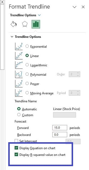
After selecting the Display Options the chart will update and you can close the ‘Format Trendline‘ pane.
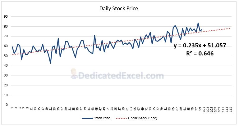
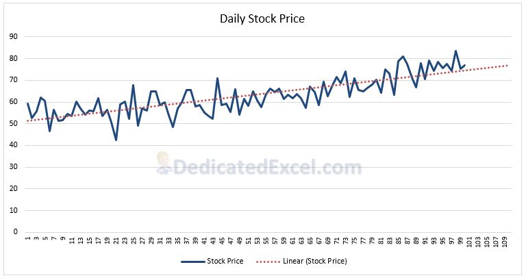
What Does the Equation Show?
You might remember from some hazy math lesson that the equation y = mx + b is typical for a linear trendline. The equation shown on the Excel chart is the linear trendline equation for your trendline.
You can utilise the trend equation for predicting future values or understanding specific data points. You can also use it to calculate the dependent variable (Y) for any given independent variable (X).
For example, the chart shows the daily stock price for the past 100 days and by creating a trendline the trendline equation is shown as y = 0.235x + 51.057. Using this equation we can calculate the forecasted price for day 101.
- y = 0.235 x 101 + 51.057
- which equals 74.79
What Does the R-Squared value Show?
The R-Squared value indicates how well the trendline fits your data. The value will range from 0 to 1 and it helps you understand how well the trendline models your data. A higher R-squared value (closer to 1) means a better fit.
Consider the example above where the R-Squared value is 0.646. This suggests that 64.6% of the variation in the stock price is explained by the linear model. At 64.6% it indicates a moderate level of accuracy but it does imply there are other factors not included by this model that may significantly influence the stock price.
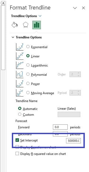
Set Intercept
The last of the features to explore after you have learned to add a trendline to an Excel chart is the ‘Set Intercept‘ feature. This is a handy tool for adjusting your trendline in a chart.
Imagine your trendline as a hiking path on a hill. The ‘Set Intercept‘ lets you choose where this path starts on the vertical ‘Y-axis’ (which is like deciding the height at which your hike begins).
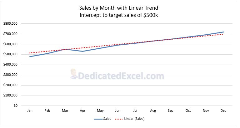
Let’s say you’re analysing the sales data of a company and you want to create a trendline that reflects a specific starting point, like a sales target or a historical benchmark. For instance, if the company had set a goal to start the year with $500,000 in sales, you could use the ‘Set Intercept‘ to set the y-intercept at 500,000. This visually aligns the trendline with the company’s goal, making it easier to see how actual sales compare to this target over time.
To activate click on your trendline then check the ‘Set Intercept‘ box in the ‘Format Trendline‘ pane, updating the adjacent box with your y-intercept value.
Factors to Consider
It’s important to use the ‘Set Intercept‘ option judiciously, especially when the accuracy and authenticity of data representation are crucial.
For example, in scientific data analysis where the true origin point of data is vital for interpretation, arbitrarily setting the y-intercept could mislead the data’s true trend. Similarly, in financial analysis, if you’re trying to predict future stock prices based on past trends, manipulating the starting point of the trendline could give an inaccurate picture of the stock’s trajectory.
In these cases, it’s best to let Excel automatically determine the y-intercept based on the actual data points to maintain the integrity and accuracy of the analysis.
Summary
Congratulations, you started this journey wanting to learn how to add a trendline to an Excel chart and now you’re fully equipped to harness the power of trendlines in Excel charts! This comprehensive guide has taken you through a journey of mastering trendlines, ensuring you can apply them effectively in your data analysis. Here’s what we’ve explored:
- Add a Trendline to an Excel Chart: Step-by-step instructions on how to add a trendline to your Excel charts, turning raw data into insightful visual trends.
- Exploring Trend Types: We delved into the various trendline options available in Excel – linear, exponential, logarithmic, polynomial, power, and moving average. Each type was explained with its purpose and practical scenarios where it’s most applicable, giving you the knowledge to choose the right trend type for your data.
- Forecasting with Trendlines: A detailed look at how to extend your trendlines for future predictions. We discussed both the visual aspects and the mathematical underpinnings, including how to use the trend equation and understand the significance of R-squared values for more accurate forecasting.
- Utilizing ‘Set Intercept’: The guide wrapped up with insights into the ‘Set Intercept’ feature. We highlighted when and why this tool can be invaluable for aligning your trendline with specific goals or benchmarks, and also cautioned about scenarios where it might not be appropriate to ensure you use it wisely.
With these tools and knowledge at your disposal, you’re now ready to elevate your data analysis and make more informed decisions using Excel trendlines.
Keep Excelling,
Craving more Excel wizardry? You’re unstoppable! For a fun twist, check out our free Excel Dollar Cost Averaging Calculator. Download your copy and start exploring Excel’s potential today!