
In today’s tutorial, we will explore how to create a Pareto Chart in Excel. This powerful tool is invaluable for identifying the most significant factors in a dataset. Whether you are a beginner or looking to refresh your Excel skills, this step-by-step guide will walk you through the process of creating an effective Pareto Chart.
This Post Covers
- What is a Pareto Chart?
- What is the Pareto Principle?
- How to Create a Pareto Chart in Excel
- Use Cases for Pareto Charts in Excel
- Did You Know? – Fun Fact
- Summary
What is a Pareto Chart?
A Pareto Chart is a type of chart that combines a bar and a line graph.
Named after Vilfredo Pareto, it highlights the major factors in a dataset and is based on the Pareto Principle, which states that roughly 80% of effects come from 20% of the causes.
The Pareto Chart, stemming from Pareto’s principle, has become an essential tool in various fields beyond economics and quality management. It is widely used in business analysis, project management, and process optimization. The chart’s ability to visually represent the most significant factors contributing to a particular effect makes it an invaluable tool for decision-making and prioritizing actions.
What is the Pareto Principle?
The Pareto Principle, often referred to as the “80/20 rule”, is a concept that suggests a disproportionate relationship between inputs and outputs. The principle originated from his discovery that 80% of Italy’s land was owned by about 20% of its population. This observation led to broader applications of the principle across various fields.
At its core, the Pareto Principle posits that in many scenarios, approximately 80% of effects come from 20% of causes. This principle has been widely observed in numerous areas such as business, economics, health care, and even personal productivity. For instance, in business, it might be seen that 80% of sales come from 20% of customers, or in software development, that 80% of errors are caused by 20% of bugs.
It’s important to note that the 80/20 ratio is not a fixed, universal law but rather a heuristic that approximately describes many distributions. The Pareto Principle is a valuable tool for analysing efficiency and prioritizing resources, helping to focus on the most significant factors that contribute to a given outcome.
How to Create a Pareto Chart in Excel
To learn how to create a Pareto Chart in Excel we can use a basic Example.
For this example, we’ll use a scenario relevant to many businesses: customer feedback analysis. This dataset will list different types of customer complaints received by a company and the frequency of each complaint type. Our data fields are:
- Complaint Type: Categories of customer complaints.
- No of Complaints: The number of times each type of complaint was received over a certain period.
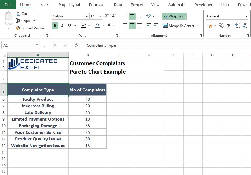
This dataset provides a simple yet effective basis for demonstrating the Pareto Chart creation process in Excel. It shows various customer complaints and how often each occurs, making it an excellent candidate for applying the Pareto Principle (80/20 rule) to identify the most significant issues to the business.
Organize Your Data
The first step is to get your data organized.
- Ensure your data is organized into 2 columns. The first containing “Complaint Type” and the second containing “No of Complaints”.
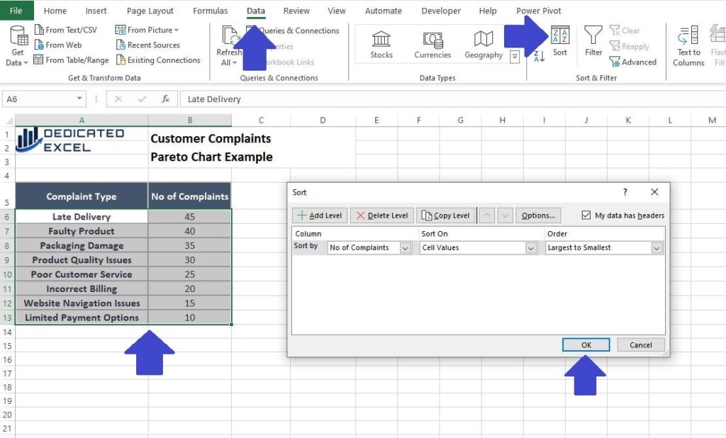
- Select all your data in both columns so that Excel highlights it.
- Navigate to the ‘Data‘ tab and click ‘Sort‘.
- Choose to sort by ‘No of Complaints‘ in ‘Largest to Smallest‘ order, also known as ‘Descending‘ order.
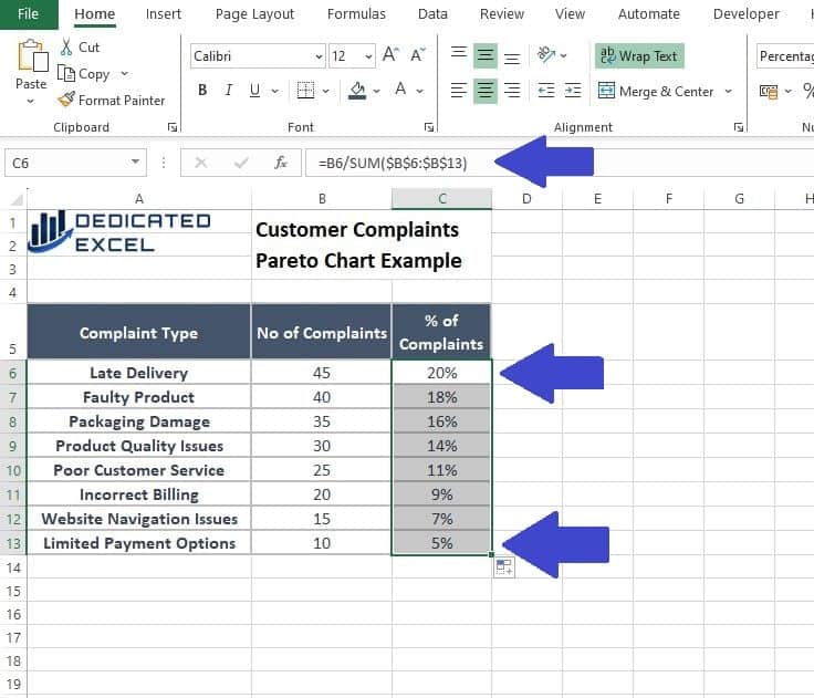
Calculate Cumulative Percentages
The next step is to calculate our percentages. First we need to calculate the Percentage of Complaints, representing each complaint as a percentage of the overall number of complaints.
- In Column C, beside your first frequency value, enter the formula =B6/SUM($B$6:$B$13) to calculate the percentage of the first value. Make sure you use absolute references to set the range, that’s the dollar signs in Excel formula.
- Fill down this formula to the end of your data to calculate percentages for all entries.
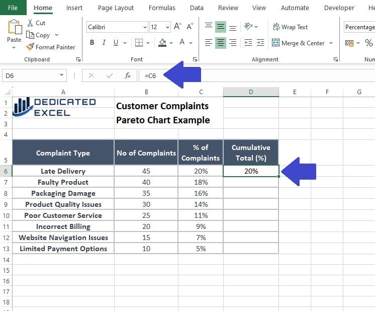
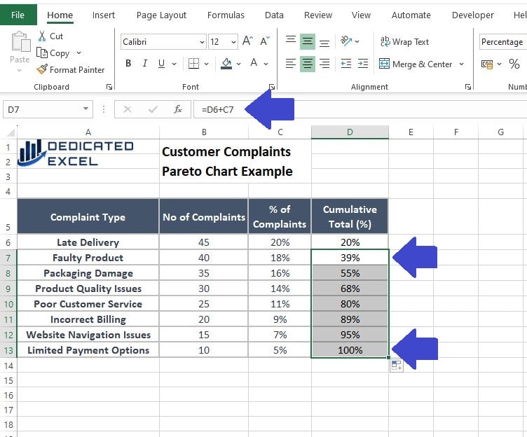
Next we create a Cumulative Total of the Complaints (in percentage terms).
- In Column D, calculate the cumulative percentage.
- Enter =C6 in the first row, and for the next rows, use the formula =D6+C7 and fill it down.
Create the Pareto Chart
With our calculations completed the final step is to produce the Pareto Chart.
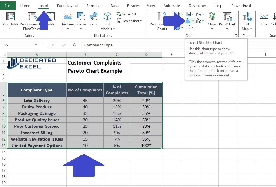
- Select all the data, including the headers. Specifically for this example we need the data in Column A and Column D.
- Navigate to the ‘Insert‘ tab and click ‘Insert Statistics Chart‘ (found in the ‘Charts’ section).
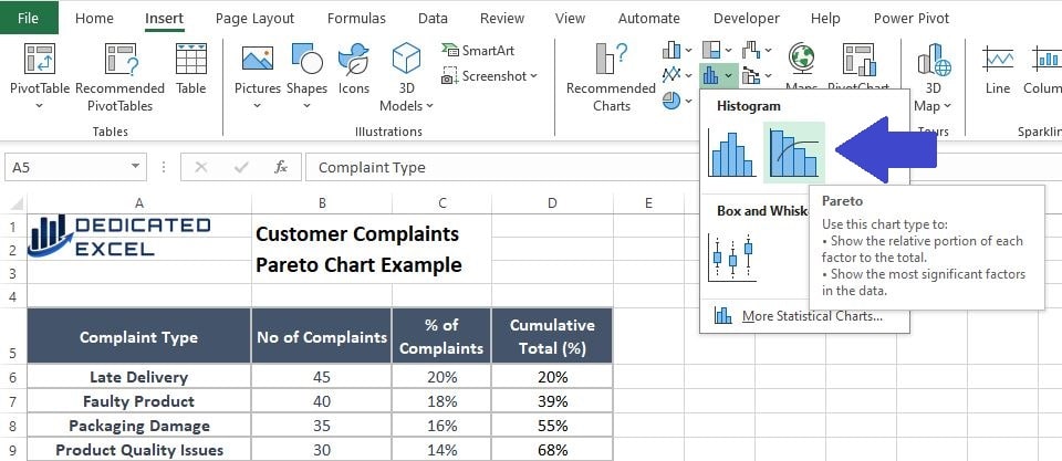
- Select ‘Pareto Chart‘.
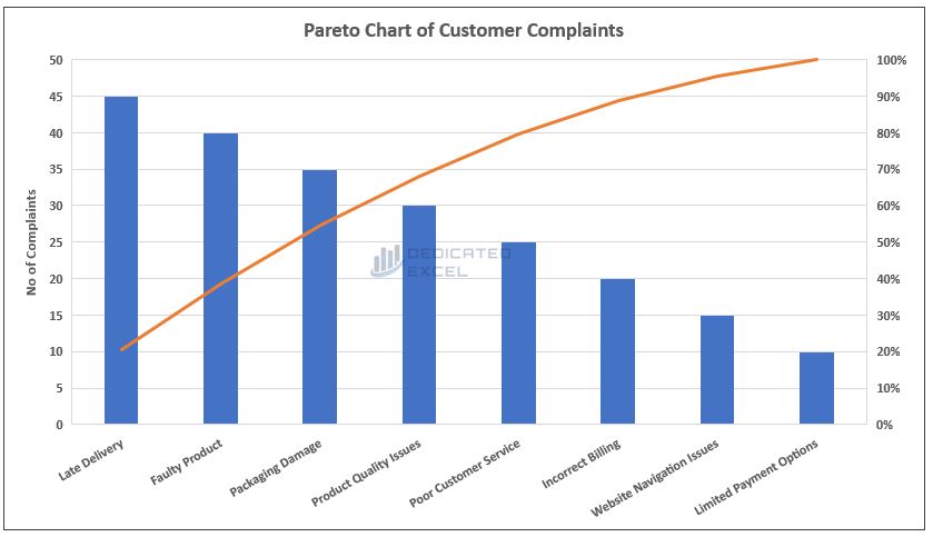
The Pareto Chart Result
Having successfully created the Pareto chart in Excel, we can now delve into the insights it offers.
This chart effectively identifies the frequency of different types of customer complaints. The most common issues are represented by the taller bars on the left side of the chart, with ‘Late Delivery’ and ‘Faulty Product’ standing out as the tallest bars, indicating their high frequency.
Interestingly, in our analysis, the line representing the cumulative percentage crosses the 80% mark at the fifth type of complaint, specifically at ‘Customer Service‘.
This observation demonstrates a variation from the traditional Pareto Principle. Instead of the expected 80/20 distribution, our Pareto chart in Excel reveals that 62.5% of the complaint types (5 out of 8) account for 80% of all complaints. This variance highlights the principle’s flexibility and its application as a general guideline rather than a strict rule.
Use Case for Pareto Charts in Excel
The Pareto Chart is a versatile tool in Excel, offering valuable insights across various fields and applications. Understanding its use cases can help you harness its potential to analyse and interpret data effectively. Here are some key areas where a Pareto Chart in Excel can prove particularly useful:
- Quality Control
- Identifying Key Issues: In quality control, Pareto Charts help in pinpointing the most common sources of defects or problems. By highlighting the issues that contribute the most to overall defects, quality managers can prioritize efforts to tackle these first.
- Process Improvement: It’s an excellent tool for root cause analysis, helping teams focus on factors that will have the greatest impact if addressed.
- Business and Operations Management
- Customer Feedback Analysis: Pareto Charts can be used to categorize and prioritize customer complaints or feedback, focusing on the most significant areas for improvement.
- Inventory Management: They assist in inventory analysis, identifying a small percentage of products that may account for a large portion of sales or stock issues.
- Financial Analysis
- Cost Reduction: In finance, Pareto Charts help identify the largest areas of expenditure, providing insights into where cost reduction efforts should be concentrated.
- Revenue Analysis: They are useful for analysing different revenue streams to determine which are the most lucrative.
- Healthcare and Medical Field
- Patient Care: Pareto Charts assist in analysing patient complaints or symptoms, prioritizing the most frequent or severe for better patient care.
- Resource Allocation: They are used to determine the allocation of resources based on the most common health issues or treatments.
- Personal and Professional Development
- Skill Improvement: Individuals can use Pareto Charts to identify key skills or activities that will most significantly impact their career or personal development.
- Time Management: They are effective in analysing how time is spent, focusing on activities that yield the most productive outcomes.

Did You Know?
Vilfredo Pareto, born in Italy in 1848, was an economist and sociologist. Interestingly, Pareto himself did not invent the Pareto Chart. The chart was developed later by quality management pioneer Joseph M. Juran, who applied Pareto’s principle to quality control. Juran recognized that the 80/20 rule could be effectively used to identify the most significant factors in a range of issues, especially in quality control processes. He named this visual tool the Pareto Chart in honour of Vilfredo Pareto, linking it to the foundational concept of the Pareto Principle.
Summary
In summary, our exploration of the Pareto Chart in Excel has provided a comprehensive understanding of this powerful analytical tool. By learning how to create and interpret Pareto Charts, you can effectively apply the Pareto Principle to a wide range of scenarios, from quality control to customer feedback analysis.
Understanding the 80/20 rule, as illustrated by the Pareto Principle, is a key takeaway from this tutorial. It emphasizes that a majority of outcomes (roughly 80%) are often determined by a minority of causes (about 20%). This insight is invaluable across various domains, be it in business strategy, operational efficiency, or personal productivity.
Remember, the Pareto Chart is more than a mere visualization; it’s a lens through which we can view and analyse data to discern the most impactful elements. Whether you’re a beginner or an experienced Excel user, mastering the Pareto Chart in Excel can significantly enhance your data analysis skills.
Keep Excelling,

Ready to elevate your Excel skills further? Dive into our next tutorial, Mastering the Excel Weighted Average Formula. This guide will unravel the secrets of advanced data analysis, helping you gain a deeper understanding and more precise control over your datasets.