
Creating a Pie chart in Excel might seem straightforward at first glance, but turning a simple chart into an awesome, insightful visualization requires a bit more finesse.
Whether you’re presenting sales data, survey results, or any data distribution, a well-crafted pie chart in Excel can transform your data into a compelling story.
In this guide, I’ll share insights on not just how to insert a pie chart or tweak its appearance, which you might already know, but also on when and why to use this form of visualization, along with additional tips to elevate your charts from good to great.
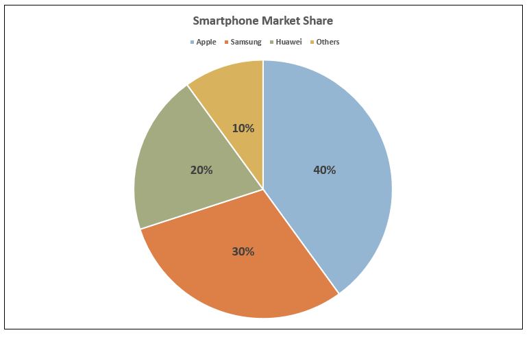
Table of Contents
Introduction to Pie Charts in Excel
Pie charts are one of the most popular tools in data visualization. Their strength lies in their ability to show parts of a whole in a circular graph, where each slice represents a proportion of the total.
Creating a Pie chart in Excel is a simple process that allows users to quickly convert rows of data into a visual story.
While the basics involve selecting your data and choosing the pie chart option, creating an awesome pie chart involves understanding your data, knowing when a pie chart is the most effective option, and applying design principles to make your chart not only informative but also visually appealing.
When to Use a Pie Chart in Excel
The decision to use a pie chart in Excel should be strategic.
You should consider using a pie chart when:
- You have a limited number of categories (ideally between 2 to 6) to prevent the chart from becoming cluttered and hard to read.
- Your data represents parts of a whole and you want to highlight the percentage or proportion of each category within the total.
- You aim to make an immediate visual impact, as pie charts are easily understood at a glance by a non-technical audience.
However, it’s important to use pie charts only when your categories do not overlap and when each category’s contribution to the whole is clear.
If your data involves time series, overlaps between categories, or if you need to compare precise values between categories, other types of charts like bar charts or line graphs may be more appropriate.
How-to Guide with Real-World Example
Let’s create a Pie chart in Excel and explore how to enhance its professional appearance with Excel’s features.
Step 1: Prepare Your Data
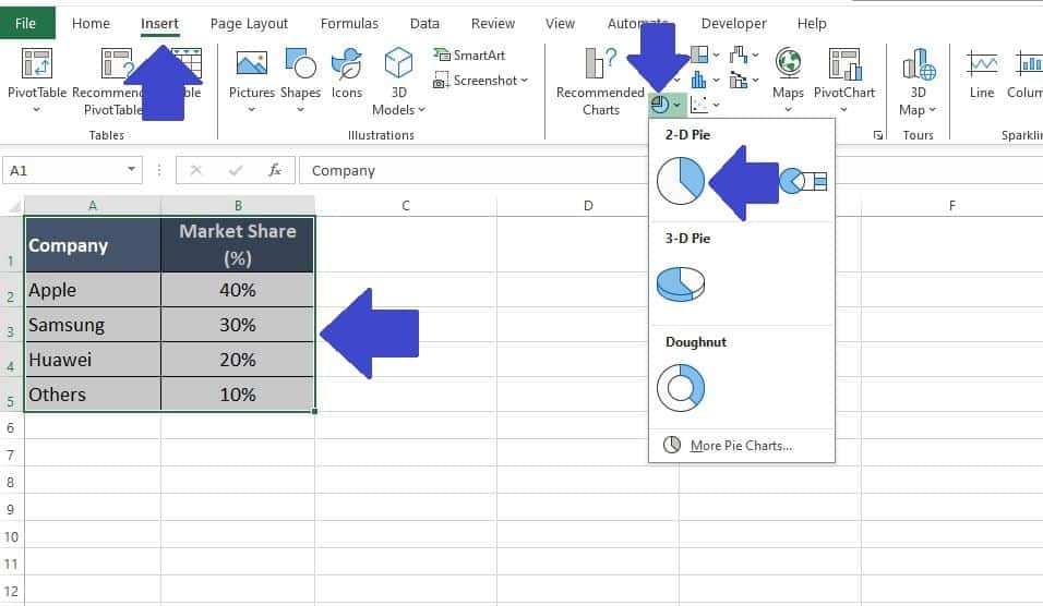
For this example, let’s assume we have the market share data for four smartphone manufacturers: Apple, Samsung, Huawei, and Others.
You can copy the data table below and paste directly into an Excel workbook if you would like to follow along:
| Company | Market Share (%) |
| Apple | 40% |
| Samsung | 30% |
| Huawei | 20% |
| Other | 10% |
Step 2: Insert a Basic Pie Chart
- Select your data range, including both the Company names and their Market Share percentages.
- Navigate to the ‘Insert‘ tab on the Excel Ribbon.
- Click on the ‘Pie Chart‘ icon in the Charts group and choose the first option ‘2-D Pie‘.

Customizing the Pie Chart
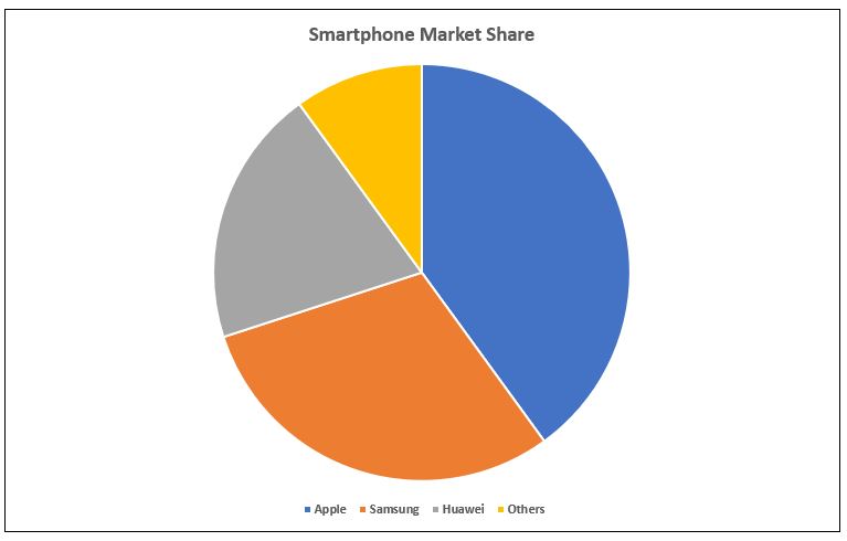
When you first create a pie chart in Excel, it’s a blank canvas awaiting your personal touch.
The goal of customization is to transform this initial, generic representation into a clear and legible masterpiece that communicates your data’s story effectively.
With clarity and legibility as our guiding principles, let’s delve into the basic customizations that can elevate your pie chart from standard to standout.
Edit the Chart Title
To give your pie chart a sharp and focused identity, start by refining its title. A clear and concise title is crucial for instantly conveying the essence of your data.
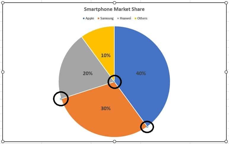
- Click on the ‘Chart Title‘ to begin editing. Bearing the importance of precision and brevity in mind, let’s update our Pie Chart Title to “Smartphone Market Share,” setting the stage for a focused discussion on the data at hand.
Change Legend Position
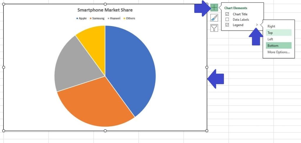
Optimizing the clarity of your pie chart may also involve adjusting the legend’s placement.
This is not just a matter of personal preference but a strategic choice to enhance the chart’s readability.
By clicking and dragging the legend, you can explore different positions on the chart.
However, for the sake of precision and presentation, it’s advisable to place the legend in a location that complements the data visualization, ensuring that it aids rather than obstructs the viewer’s understanding.
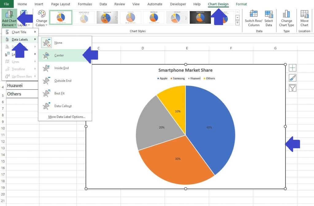
- First click on the Chart. You’ll notice a plus icon appear next to the chart, this is the ‘Chart Elements‘ button.
- Next, click on the ‘Chart Elements‘ button and you will see options for the ‘Chart Title‘, ‘Data Labels‘ and ‘Legend‘.
- Click on the arrow adjacent to ‘Legend‘ and change the position to ‘Top‘.
Data Labels
Data labels can turn a good pie chart into a great one by making it easier to understand at a glance.
While it’s sometimes possible to guess which slices are the largest, we can make our chart much clearer by adding data labels.
This means showing the exact percentage of market share directly on the pie slices for each manufacturer.
To add these labels, you can either use the ‘Chart Elements‘ button, similar to what we did with the Chart Legends, or go through the ‘Chart Design‘ menu on the Excel Ribbon.
- Click on the Chart. You’ll notice the ‘Chart Design‘ menu becomes available on the Excel Ribbon, click on the ‘Chart Design‘ menu.
- Next, click on ‘Add Chart Element‘, which is now the first option on the Excel Ribbon.
- In the ‘Chart Elements‘ options click on ‘Data Labels‘ and then select ‘Center‘. This will place the percentages for our Smartphone Market Share in the center of each slice.
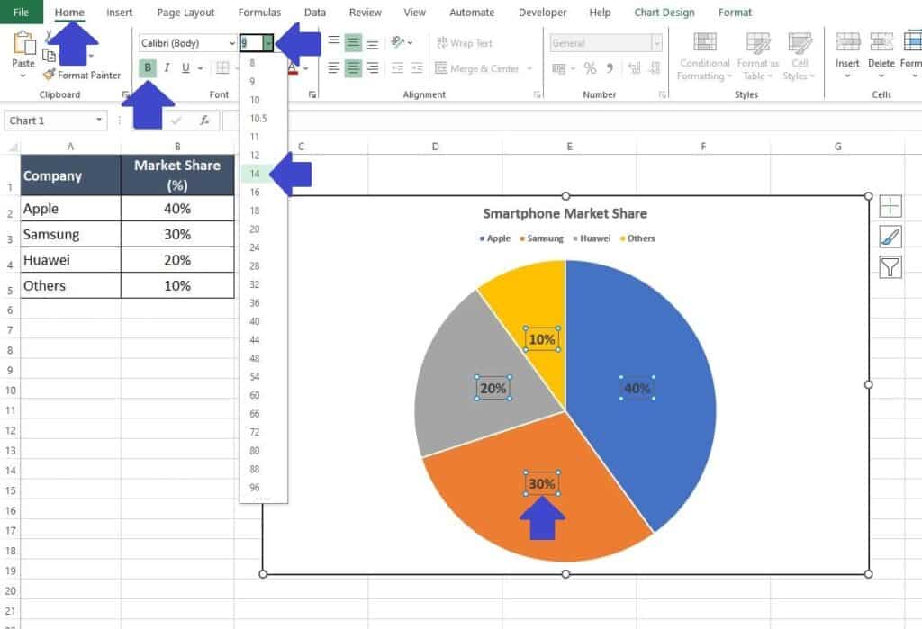
It is possible you might find the Data Labels need some further adjustment.
In our example they look on the small size. We can increase the font size and make them ‘Bold‘ so they really stand out to the people viewing the pie chart.
- Click on one of the Data Labels (percentages) on the Pie Chart, this will highlight all of the labels.
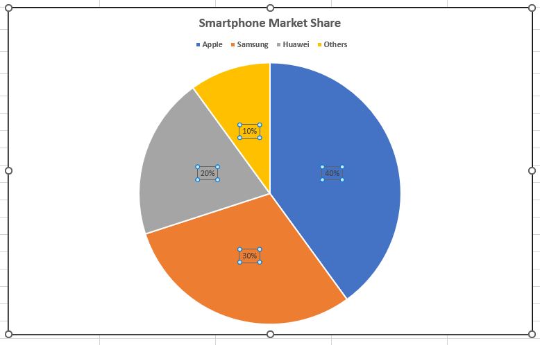
- Next, on the Excel Ribbon, make sure you click back to the ‘Home‘ menu.
- From the ‘Home‘ menu you can adjust the ‘Font Size‘ and the embolden the Data Labels using the options in the Font section of the Ribbon, as you would for standard text formatting.
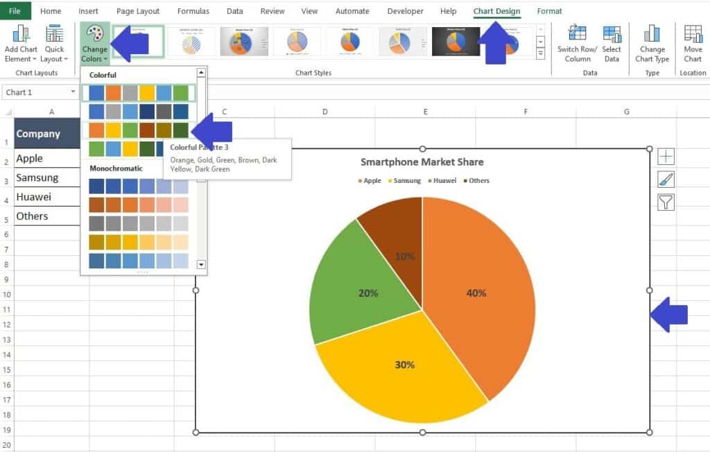
Changing Colors
If you want to change the colors used on your Pie Chart you can do so in a couple of ways.
To change all of the Pie chart colors in one swift manner:
- First click on the chart to select it. Then Navigate to the ‘Chart Design‘ menu on the Excel Ribbon.
- Then on the ‘Chart Design‘ menu in the Excel Ribbon click on ‘Change Colors‘ and select your preferred color scheme. You might need to test a few before you find a color scheme that suits you.
Alternatively, you can change the colors of individual slices of the Pie chart.
This method provides you with complete control to choose the color scheme applied and even change shading options or add patterns to the slices.
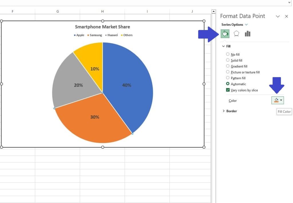
- First click twice on the slice you want to adjust.
The first click will select the entire pie (all slices) and the second click ensures you have the individual slice selected, as represented by the 3 small circles around the selected slice.
- With the individual slice selected right-click on the slice and select the option ‘Format Data Point‘.
This will bring up the ‘Format Data Point‘ window on the right side of your worksheet. - Select the Bucket Icon within the ‘Format Data Point‘ window.
This will allow you to change the color of the individual slice, add gradient fill (shades) or use patterns.
Following these instructions allows you to produce a fully customized and Pie Chart suited to your individual or company requirements.
Additional Tip for Pie Charts in Excel
To elevate your pie chart in Excel from basic to awesome, consider the following tips:
- Simplify Your Data: Too many slices can make your chart hard to read. Consider grouping smaller categories into a single “Other” category.
- Choose Colors Wisely: Use color to enhance understanding, not distract.
Assign contrasting colors to adjacent slices for better differentiation and use a consistent color scheme that aligns with the theme of your presentation or report. - Add Data Labels: Instead of relying on a legend, directly label your pie slices with their respective values or categories to make your chart easier to interpret at a glance.
- Avoid 3D Effects: While 3D charts can look appealing, they often distort perception of the data. Stick to 2D pie charts for accuracy and simplicity. If you are keen to learn more about the 3D chart route check out my guide on How to unlock the secrets of 3D charts in Excel.
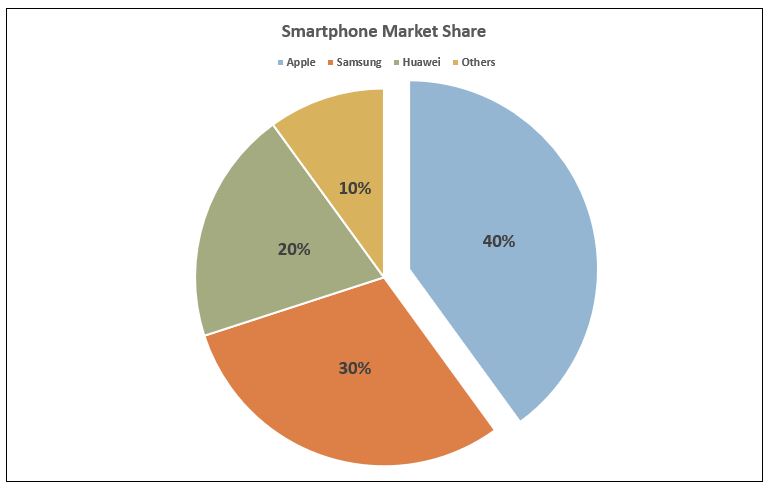
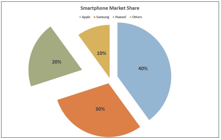
- Use Exploded Slices Sparingly: Exploding a slice, achieved by selecting a slice and pulling it away from the chart, can emphasize a particular data point.
However, use this feature sparingly to avoid cluttering your chart and diluting its impact.
Summary
A pie chart in Excel is more than just a tool for displaying parts of a whole. It’s an opportunity to tell a story with your data, to highlight what’s important, and to engage your audience with clear, compelling visuals.
By carefully choosing when to use a pie chart, simplifying and organizing your data, and applying design best practices, you can create pie charts that are not just visually appealing but also rich in insights.
Remember, the goal is not just to show data but to make it memorable and understandable at a glance.
By using this guide and techniques, your pie charts will not only serve as effective tools for data analysis but also as masterpieces of information design.
Keep Excelling,

Now that you’ve mastered creating an awesome pie chart in Excel, why stop there? Elevate your data visualization skills even further by learning how to add a goal line to your charts.
It’s the perfect next step to not only showcase your data but also highlight key achievements and targets. Click to discover how to create a goal line on a chart and make your data presentations even more impactful.