How to Create an Excel Chart with Two Y-Axes

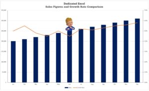
Have you ever wanted to plot two different types of data on the same Excel chart but found yourself struggling to make sense of it all? Perhaps you’ve tried comparing sales figures with the number of products sold, only to end up with a jumbled and confusing chart. The solution to this common dilemma lies …

Read more

How to Add a Trendline to an Excel Chart

Learning How to Add a Trendline to an Excel Chart is a fantastic skill for every data analyst to have. Microsoft Excel offers a powerful tool to visualize and interpret data trends through its various trendline options so whether you’re a stock market analyst, a marketer analysing sales data, or a scientist measuring environmental changes, …

Read more

Dynamic Chart Titles in Excel

Master the art of crafting a dynamic chart title in Excel with our step-by-step guide. Perfect for evolving data, this technique automates your chart titles, ensuring they’re always current without manual effort. Save time and enhance your Excel skills today. Introduction Excel’s capability to transform data into visually compelling charts is a game-changer for data …

Read more