
Today, I’m going to take you through the fascinating world of 3D charts in Excel. Imagine transforming rows of mundane data into a vibrant, three-dimensional chart that not only captures attention but also makes complex data comprehensible at a glance. That’s the power of 3D charts in Excel, and I’m here to show you how to master this art.
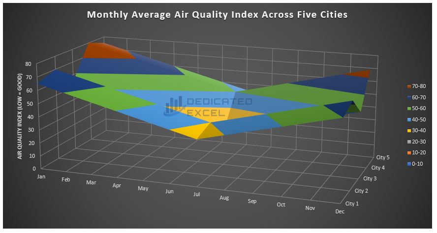
Table of Contents
- Why 3D Charts?
- When Should You Use 3D Charts in Excel?
- Basic Example – Create a 3D Column Chart
- Advanced Example – Create a 3D Surface Chart
- 10 Tips for Creating 3D Charts in Excel
- Summary
Why 3D Charts? Let’s Dive In!
First things first, why should you care about 3D charts?
Imagine you’re presenting sales data from the last five years at a company meeting.
A flat, two-dimensional chart can show trends over time, but add a third dimension, and suddenly, you’re not just looking at time and sales; you’re looking at time, sales, and perhaps regional distribution all in one captivating graphic.
This depth can be a game-changer in how data is perceived and decisions are made.
When Should You Use 3D Charts in Excel?
Deciding when to use 3D charts in Excel is crucial for effective data presentation. These visually striking charts can transform how you view and interpret data, but they are not always the right choice for every situation.
Let’s explore the scenarios where 3D charts truly shine and add value to your data analysis:
Complex Data with Multiple Variables
When your dataset includes more than two variables, a 3D chart can help in visualizing these relationships in a more comprehensive manner. For instance, if you’re looking at sales data, a 3D chart can simultaneously show sales figures (Y-axis), time periods (X-axis), and product categories or regions (Z-axis), offering a multi-dimensional perspective.
Comparative Analysis Over Time
If you need to compare how different categories have evolved over time, 3D charts can be particularly useful. They can clearly demonstrate trends and patterns across various segments, making temporal comparisons more intuitive and insightful.
Highlighting Interactions Between Data Points
3D charts excel at showing how different data sets interact with each other. They can uncover hidden relationships or correlations between variables that might not be apparent in a 2D chart.
Presentations and Reports
When you need to make a strong visual impact in a presentation or report, 3D charts can be very effective. They are engaging and can make complex data more accessible to a non-technical audience.
Spatial Data Representation
For datasets that naturally occupy three dimensions, such as geographical data or architectural plans, 3D charts can provide a realistic and clear representation.
Remember, in cases where simplicity and precision are key, or when the third dimension doesn’t add significant value to the interpretation of the data, sticking with 2D charts is advisable. Overuse or inappropriate use of 3D charts can lead to confusion and misinterpretation of data.
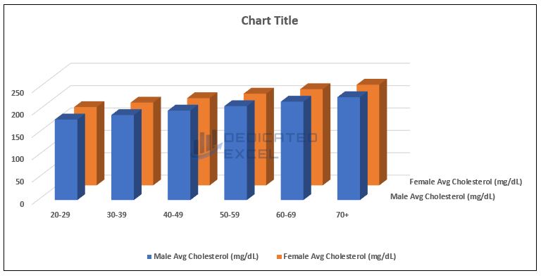
Basic Example – Create a 3D Column Chart in Excel
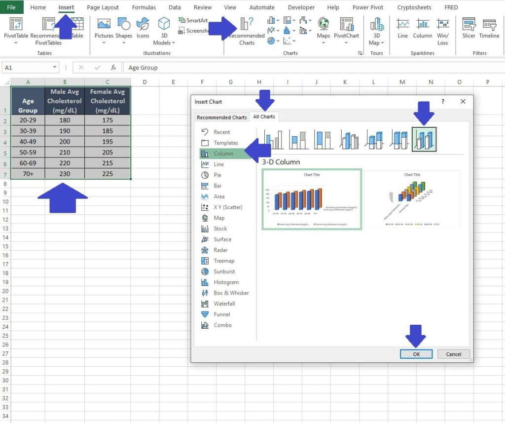
Let’s consider a dataset related to medical data, for instance, the average cholesterol levels by age and gender. The dataset might look like this:
Note: You can copy and paste this dataset into Excel if you wish to follow along.
| Age Group | Male Avg Cholesterol (mg/dL) | Female Avg Cholesterol (mg/dL) |
| 20-29 | 180 | 175 |
| 30-39 | 190 | 185 |
| 40-49 | 200 | 195 |
| 50-59 | 210 | 205 |
| 60-69 | 220 | 215 |
| 70+ | 230 | 225 |
Create the Initial 3D Chart
We can turn our cholesterol dataset into a 3D chart by completing the following steps:
- Select the data in your Excel worksheet.
- Go to the ‘Insert‘ tab and then click on ‘Recommended Charts’.
- In the ‘Insert Chart‘ window that pops up click on the ‘All Charts‘ tab.
- Select the ‘Column‘ option followed by the ‘3-D Column‘ option then click ‘OK‘ to produce the initial 3D chart.
Formatting the 3D Chart
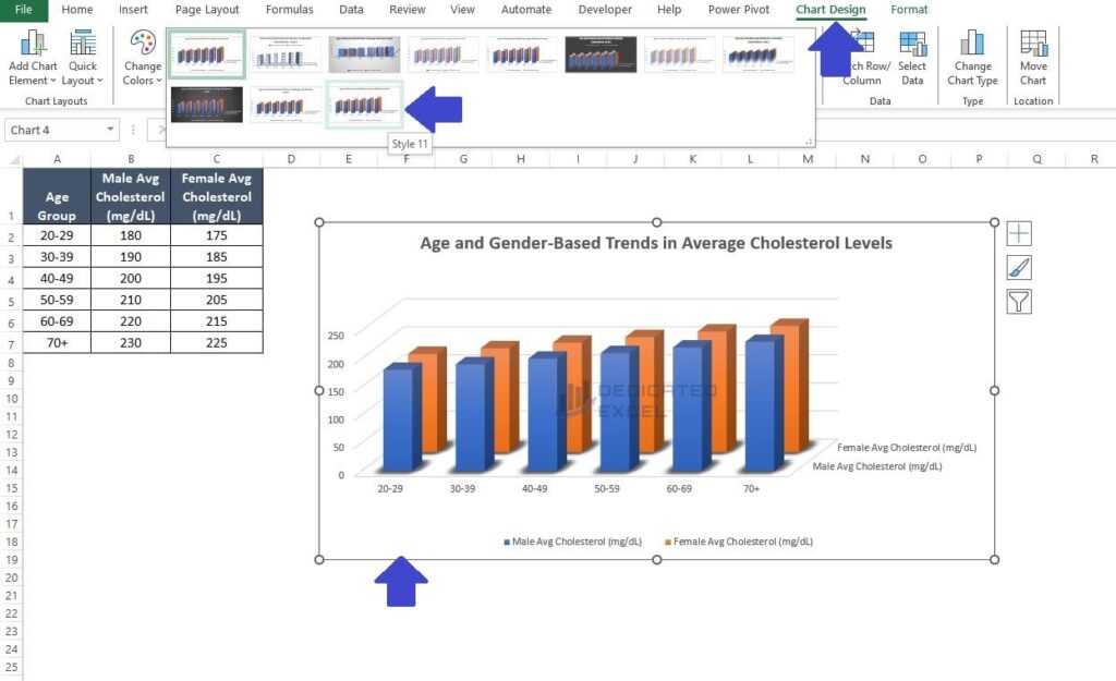
Once the basic 3D chart is in place, it’s time to delve into the art of formatting. This crucial step transforms our chart into a clear and visually compelling representation of our data, ensuring it’s not just informative, but also a visual delight!
- Edit the Title: Click on the ‘Chart Title‘ and edit the text to ‘Age and Gender-Based Trends in Average Cholesterol Levels‘
- Change the Style: Click on the chart to select it, then on the Excel Ribbon select ‘Chart Design‘. Scroll down the main ‘Chart Styles‘ section and select ‘Style 11‘. This adds a nice glow around the base of our 3-D columns making everything stand out more.
Change the Rotation of the 3D Chart
Lastly, we can explore changing the rotation to enhance the chart’s perspective.
- Right-click on the chart and select ‘3D Rotation‘. In the ‘Format Chart Area‘ window that appears, navigate to the ‘X Rotation‘ option and change it to 30 degrees. Then, adjust the ‘Y Rotation‘ to 20 degrees.
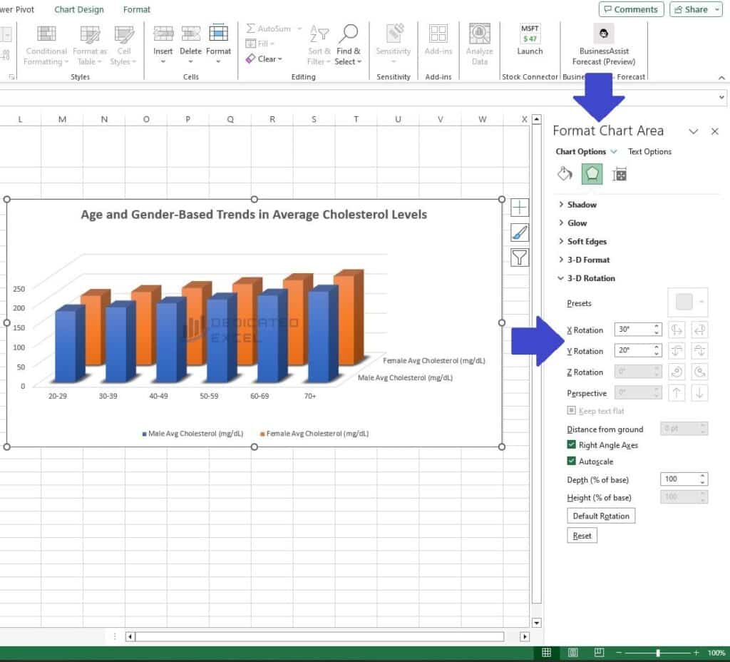
You’ll notice that changing the ‘X rotation‘ alters the depth perception of the chart, while adjusting the ‘Y rotation‘ modifies the angle of view, enhancing the overall visual impact.
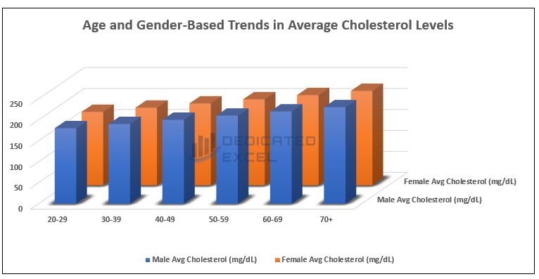
The final 3D Chart creation now looks great. However, don’t be afraid to play around with different rotations or layouts to find the exact settings that suit you, and your data, best.
Advanced Example – Create a 3D Surface Chart in Excel
Looking at a more advanced example. We can create a 3D surface chart to analyse the average daily Air Quality Index (AQI) values across different months of the year in various cities.
This type of data is well-suited for a 3D surface chart, as it shows variations over two dimensions: time and location.
Note: You can copy and paste this dataset into Excel if you wish to follow along.
| Month | City 1 | City 2 | City 3 | City 4 | City 5 |
| Jan | 65 | 70 | 55 | 80 | 75 |
| Feb | 60 | 65 | 50 | 75 | 70 |
| Mar | 55 | 60 | 45 | 70 | 65 |
| Apr | 50 | 55 | 40 | 65 | 60 |
| May | 45 | 50 | 35 | 60 | 55 |
| Jun | 40 | 45 | 30 | 55 | 50 |
| Jul | 35 | 40 | 25 | 50 | 45 |
| Aug | 40 | 45 | 30 | 55 | 50 |
| Sep | 45 | 50 | 35 | 60 | 55 |
| Oct | 50 | 55 | 40 | 65 | 60 |
| Nov | 55 | 60 | 45 | 70 | 65 |
| Dec | 60 | 65 | 50 | 75 | 70 |
Create the Initial 3D Chart
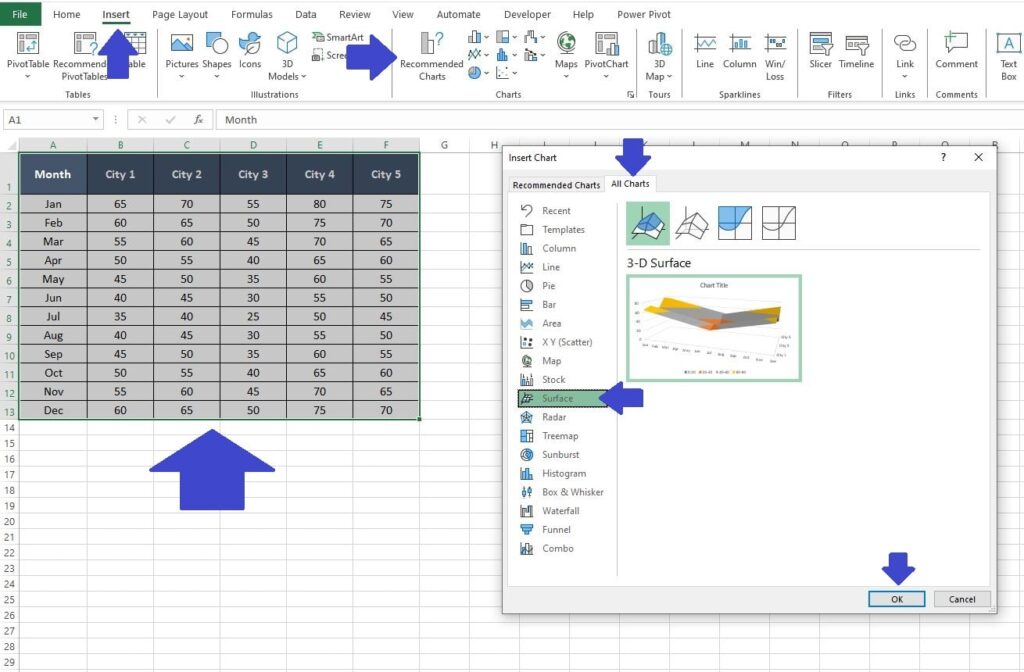
Begin crafting your first 3D surface chart in Excel by following these straightforward steps:
- Select the data in your Excel worksheet.
- Go to the ‘Insert‘ tab and then click on ‘Recommended Charts’.
- In the ‘Insert Chart‘ window that pops up click on the ‘All Charts‘ tab.
- Select the ‘Surface‘ option then click ‘OK‘ to produce the initial 3D chart.
Formatting the 3D Chart
Now we have the initial 3D surface chart created we can start to change some of the basic formatting:
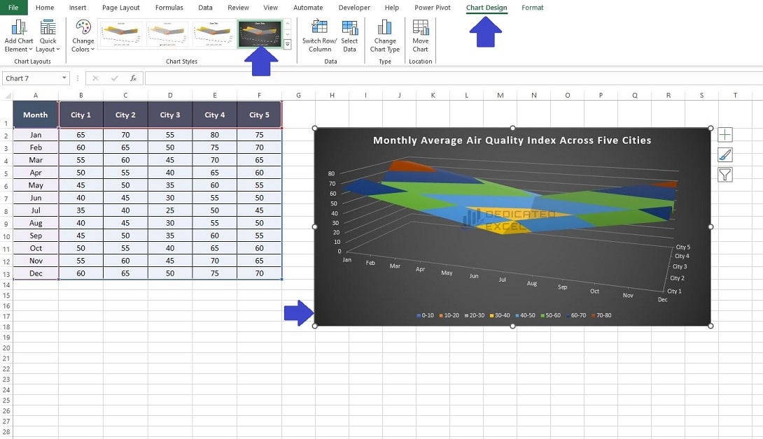
- Edit the Title: Click on the ‘Chart Title‘ and edit the text to ‘Monthly Average Air Quality Index Across Five Cities‘
- Change the Style: Click on the chart to select it, then on the Excel Ribbon select ‘Chart Design‘. Scroll down the main ‘Chart Styles‘ section and select ‘Style 4′. This gives our 3D Surface Chart a darker background to enhance the visuals on the chart.

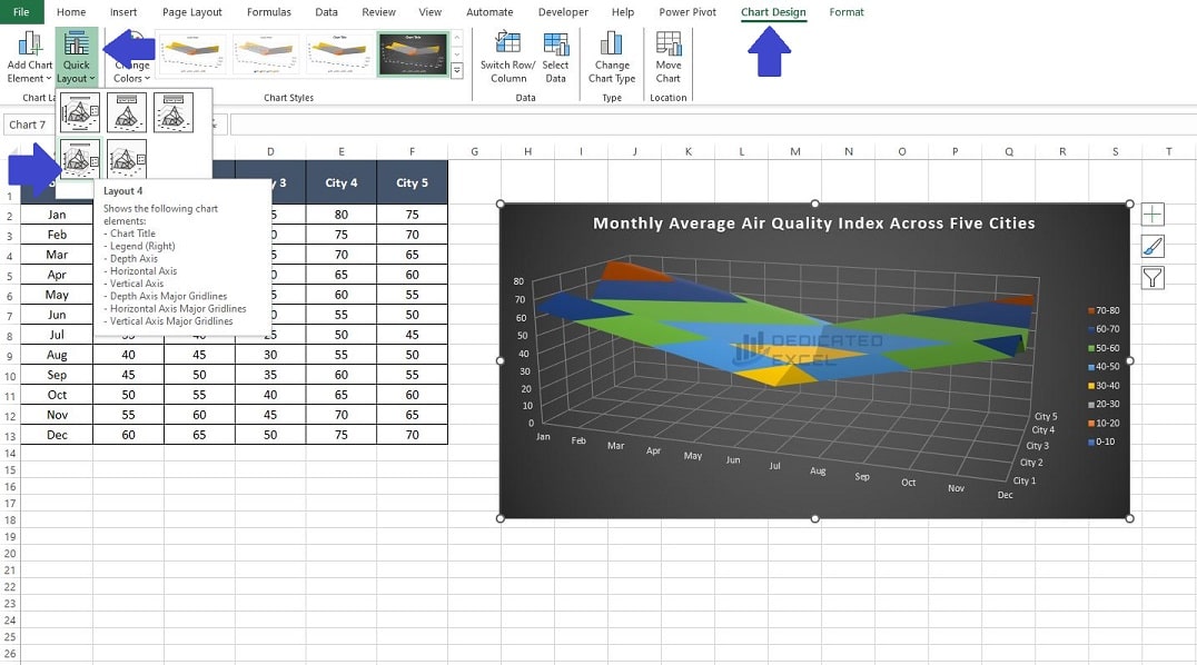
- Apply a Quick Layout: Also on the ‘Chart Design‘ click on ‘Quick Layout‘ and select ‘Layout 4‘. This will adjust where the legend is displayed and also add some gridlines to our chart-depth.

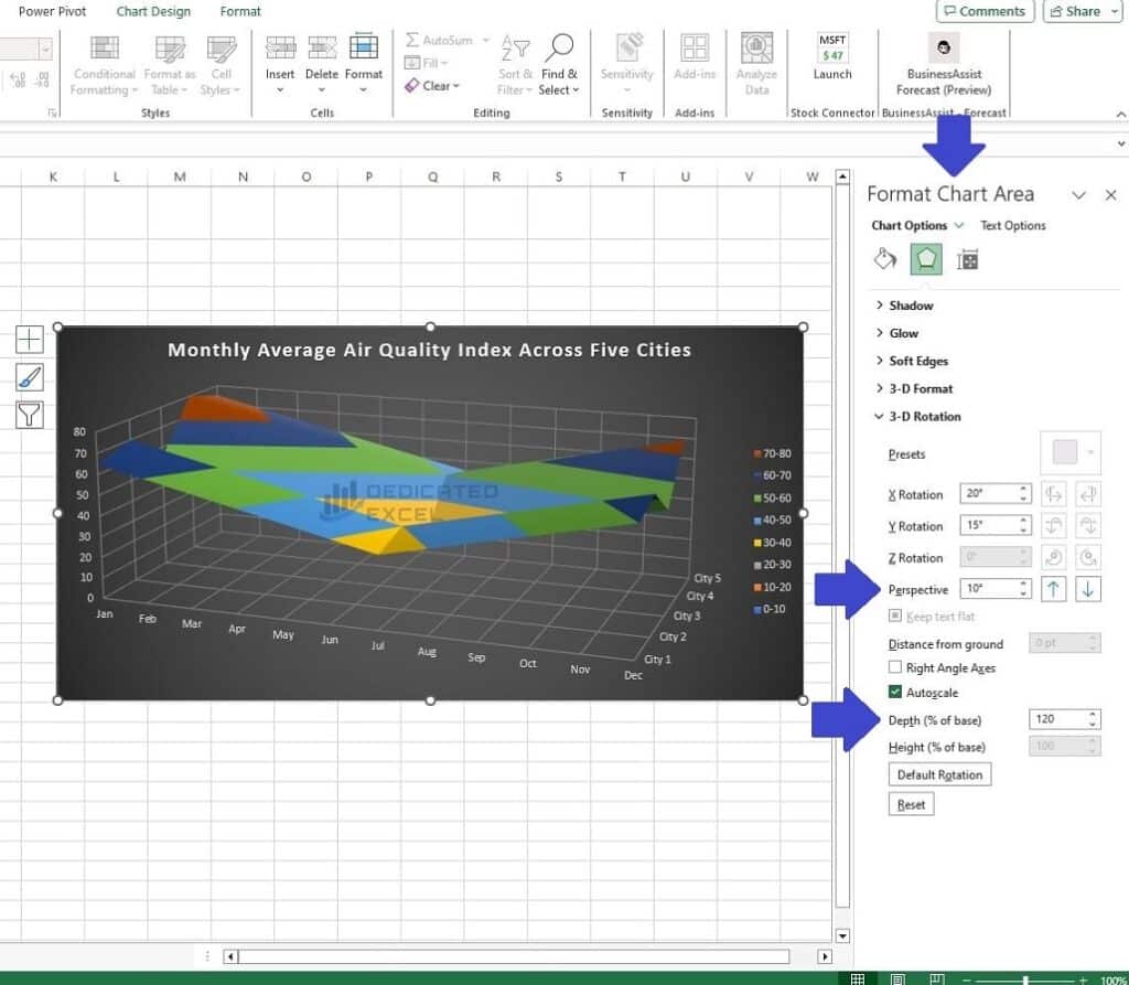
Change the Perspective and Base Depth
Lastly, let’s delve into adjusting the Perspective and Base Depth of the chart. These changes will enhance the chart’s visual depth and perspective, giving it a more dynamic and engaging appearance.
- Right-click on the chart and select ‘3D Rotation‘. In the ‘Format Chart Area‘ window that appears, navigate to the ‘Perspective‘ option and change it to 10 degrees.
- In the same ‘Format Chart Area‘ window change the ‘Depth (% of Base)‘ to 120.
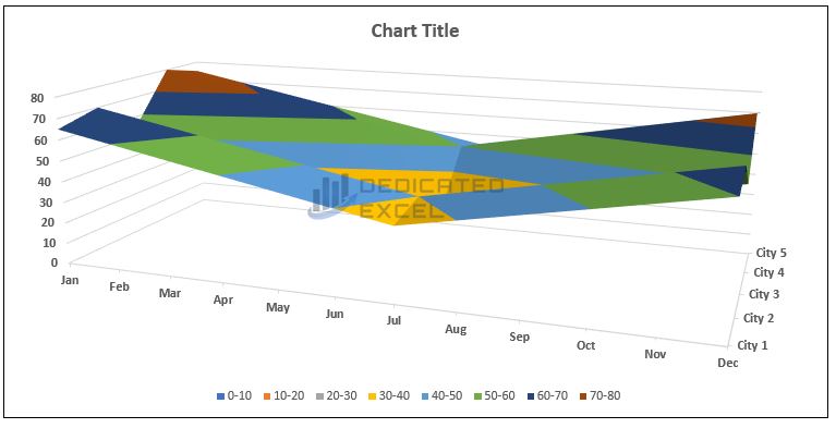
Our 3D Surface Chart is now complete. The three-dimensional aspect of the chart brings to life the intricate relationships between time, geographical location, and air quality levels. It allows us to visually discern patterns and correlations that might be less apparent in traditional two-dimensional charts.
For example, the chart demonstrates that Cities 4 and 5 consistently exhibit higher Air Quality Index values, especially during the winter months of January and December, indicating more significant air pollution challenges. Conversely, City 3 maintains the lowest AQI values throughout the year, suggesting better air quality.
Moreover, a noticeable trend across all cities is the improvement in air quality during the summer months, with a significant dip in AQI values from June to August. This seasonal pattern is crucial for environmental analysis, hinting at the influence of weather conditions on air pollution.
Such detailed visualization is invaluable in environmental studies and public health planning and the 3D Surface Chart presented here is a prime example of that.
10 Tips for Creating 3D Charts in Excel
As you have now learned creating 3D charts in Excel can be a straightforward process, but a few additional tips can elevate the effectiveness and clarity of your charts.
Here’s how to make the most out of your 3D chart creations:
1. Start with the Right Data Structure
Before you even insert a chart, ensure your data is well-organized. Data for 3D charts should be laid out in a grid format, with each axis of the chart clearly represented by columns and rows in your data set.
2. Choose the Right Type of 3D Chart
Excel offers various 3D chart types like 3D Column, 3D Line, 3D Pie, and 3D Surface charts. Select the one that best fits the story you are trying to tell with your data. For example, use 3D Column charts for comparing categories, and 3D Line charts for showing trends over time.
3. Customize Chart Elements for Clarity
After inserting your chart, spend time customizing its elements. Adjust the colour scheme to differentiate data points clearly. Use labels and legends effectively to make the chart easy to understand. Play with the angle and depth of the 3D view to present the data in the most informative way.
4. Avoid Clutter
While it’s tempting to include as much information as possible, too much detail can make your chart confusing. Focus on the most important data points to keep your chart clean and easy to read.
5. Use 3D Effects Wisely
3D effects can enhance the visual appeal of your chart but use them judiciously. Excessive use of shadows, glowing effects, or overly dramatic 3D angles can distract from the data itself.
6. Consider Your Audience
tailor the complexity and design of your chart to your audience. If your audience is not very technical, simplify the chart to convey the key insights without overwhelming them.
7. Add Contextual Information
Sometimes, the data alone isn’t enough. Add titles, annotations, or brief descriptions to provide context to your audience. This helps in making the chart more informative and impactful.
8. Testing and Feedback
Before finalizing your chart, test how it looks in different formats (like in a presentation or printed document). Getting feedback from a colleague or a friend can also provide insights into how your chart is perceived by others.
9. Keep Accessibility in Mind
Ensure that your chart is accessible to all audience members, including those with colour vision deficiencies. Use patterns or textures in addition to colours for differentiation.
10. Continuous Learning
As with any Excel feature, the more you practice with 3D charts, the better you’ll get. Experiment with different types of data and chart styles to broaden your skills.
By following these tips, you can create 3D charts in Excel that are not only visually appealing but also serve as effective tools for data analysis and presentation. Remember, a well-crafted chart can transform numbers and figures into compelling stories that drive decision-making.
Summary
As we wrap up our exploration of 3D charts in Excel, it’s clear that these dynamic visual tools are not just about adding aesthetic appeal to your data presentations. They are powerful instruments for revealing hidden trends and patterns, making complex information more digestible and engaging.
Whether it’s the simplicity yet effectiveness of a 3D column chart showcasing age and gender-based trends in cholesterol levels, or the more advanced 3D surface chart illustrating the environmental impact through air quality indices across cities, these examples highlight the versatility and depth of 3D charts.
Remember, the key to mastering 3D charts in Excel lies in knowing when and why to use them. Our 10 tips for creating 3D charts provide a roadmap to enhance your skills and ensure that your charts are not only visually impressive but also accurate and informative. As you continue your journey in data analysis and presentation, leverage these insights to transform your data into compelling stories.
Keep Excelling,

Don’t let bulky numbers clutter your perfectly crafted 3D charts! Dive into our next insightful guide: ‘How to Display Excel Numbers as Millions M‘. This tutorial will show you the simple steps to streamline your data, making your charts cleaner, more professional, and easier to interpret. Elevate your Excel expertise now and make your charts truly stand out!